Preview image. Unlock full-res
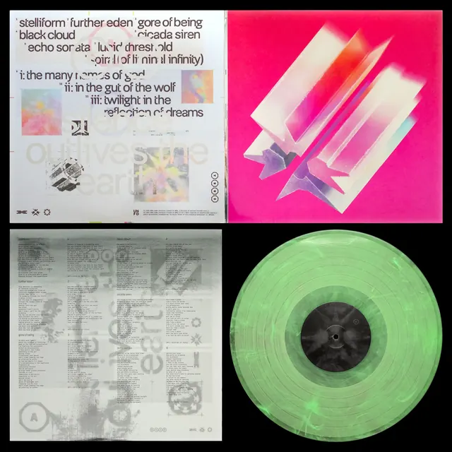
Album packaging design for Erra featuring a bold magenta cover with iridescent crystal forms, collaged inner sleeves, and colored vinyl pressings in translucent pink and green.
More like this
See all
Summary
Album packaging design for Erra featuring a bold magenta cover with iridescent crystal forms, collaged inner sleeves, and colored vinyl pressings in translucent pink and green.
Visual description
Album packaging splits into four sections: a text-dense cream inner sleeve, a white-and-pink layered 3D composition on hot magenta background, a lyrics page in gray tones, and a translucent lime-green vinyl record with black center label. Geometric prisms and stacked sheets suggest depth through rotation and layering. Color palette oscillates between vibrant neons and neutral tones.
Key takeaway
Using vibrant, contrasting color blocking (hot pink, neon green) across packaging components creates visual discontinuity reflecting experimental music and makes the album stand out on shelf, while the translucent vinyl doubles as functional object and graphic asset.
Reuse notes
Reach for this as a editorial spread reference. Pairs with typographic, abstract directions. Original by Dan Barkle.
More like this
Keep what you find
A free account saves references to boards and can send you a weekly email of picks based on what you save.
To see every result, go Pro.