Preview image. Unlock full-res
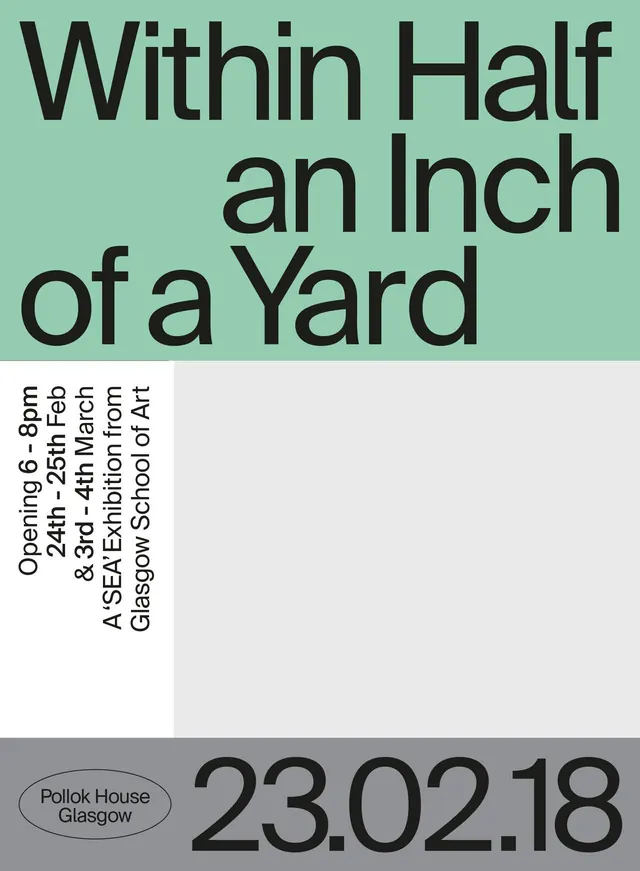
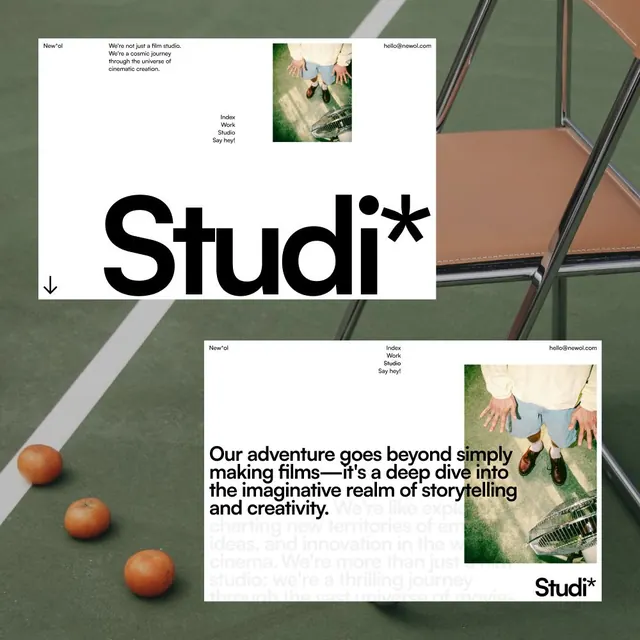
This design employs a clean, minimalist approach, relying heavily on negative space and strong typographic hierarchy to present event information.
Summary
This design employs a clean, minimalist approach, relying heavily on negative space and strong typographic hierarchy to present event information.
Visual description
This design employs a clean, minimalist approach, relying heavily on negative space and strong typographic hierarchy to present event information. The visual language is crisp and professional, using a restricted color palette to draw attention directly to the core message. The composition is balanced and structured, using distinct blocks of color and size to organize the large headline and subordinate details. A clean, readable sans-serif typeface is used throughout to ensure high legibility and a contemporary feel.
Key takeaway
A type specimen reference. Worth saving for its minimalist, typographic, clean treatment.
Reuse notes
Fits general design work.
More like this


Keep what you find
A free account saves references to boards and can send you a weekly email of picks based on what you save.
To see every result, go Pro.