Preview image. Unlock full-res
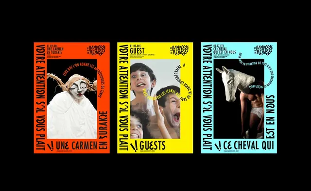
Three bold theatrical posters use oversized vertical typography, bright solid color fields, and central performance imagery.
Summary
Three bold theatrical posters use oversized vertical typography, bright solid color fields, and central performance imagery.
Visual description
Three poster designs sit side by side on a black background, each with a different solid frame color: orange, yellow, and light cyan. Large black vertical text runs along the sides of each poster, with smaller header text at the top and a centered photo-collage image inside a black rectangular window. The left poster shows a white-costumed figure, the middle poster shows several excited faces, and the right poster shows a person with a horse head mask.
Key takeaway
Use a rigid poster frame with one dominant saturated color, then break it with oversized vertical type and a single central image block. The contrast between playful imagery and strict typography gives the system energy and memorability.
Reuse notes
Reach for this when you need a campaign poster or event identity that has to feel loud, theatrical, and instantly readable from a distance. It works best when the content can be split into a strong image core plus surrounding typographic rails.