Preview image. Unlock full-res
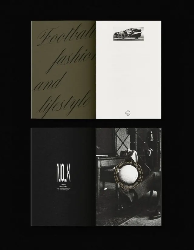
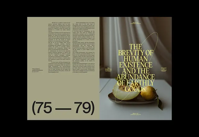
This editorial layout employs a sophisticated, high-contrast visual language, juxtaposing flowing script typography against stark photographic monochrome and deep earth tones to create a moody and luxurious feel.
Summary
This editorial layout employs a sophisticated, high-contrast visual language, juxtaposing flowing script typography against stark photographic monochrome and deep earth tones to create a moody and luxurious feel.
Visual description
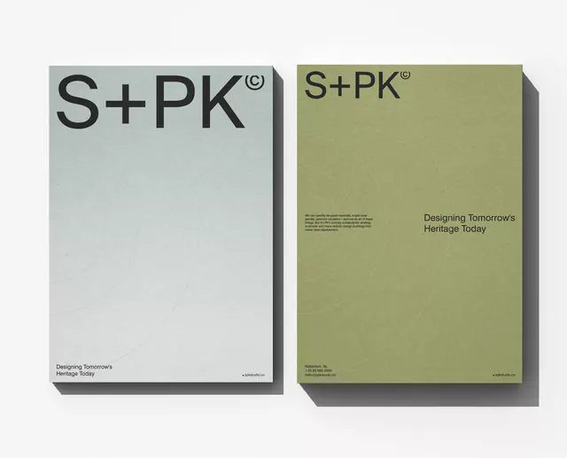
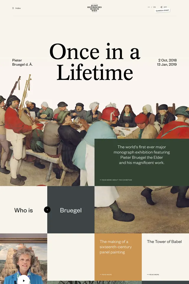
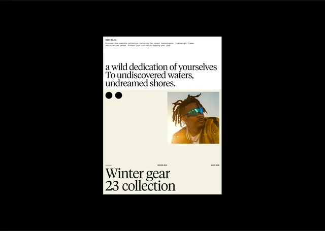
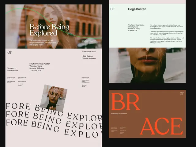
This editorial layout employs a sophisticated, high-contrast visual language, juxtaposing flowing script typography against stark photographic monochrome and deep earth tones to create a moody and luxurious feel. The composition is structured yet asymmetrical, utilizing generous negative space to emphasize key typographic elements and the featured imagery. A combination of an elegant, flowing script font for titles and a clean, stark sans-serif for branding.
Key takeaway
A type specimen reference. Worth saving for its editorial, minimalist, typographic treatment.
Reuse notes
Fits media work.
More like this
Keep what you find
A free account saves references to boards and can send you a weekly email of picks based on what you save.
To see every result, go Pro.