Preview image. Unlock full-res
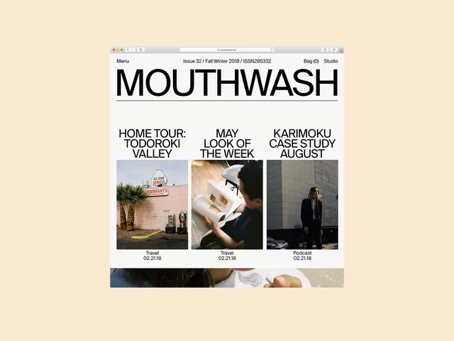
A digital magazine layout featuring a large masthead and a three-column grid of articles with photography and text.
Summary
A digital magazine layout featuring a large masthead and a three-column grid of articles with photography and text.
Visual description
The design uses a strict three-column grid with large, bold sans-serif typography for the 'MOUTHWASH' masthead. Each column contains a headline followed by a rectangular photograph and small metadata text at the bottom. The layout is clean with ample white space and a neutral color palette.
Key takeaway
Use a strong typographic hierarchy and a rigid grid system to organize diverse content types like photography and text.
Reuse notes
Apply this layout when designing digital magazines, lookbooks, or portfolio sites that require a clean, editorial aesthetic.