Preview image. Unlock full-res
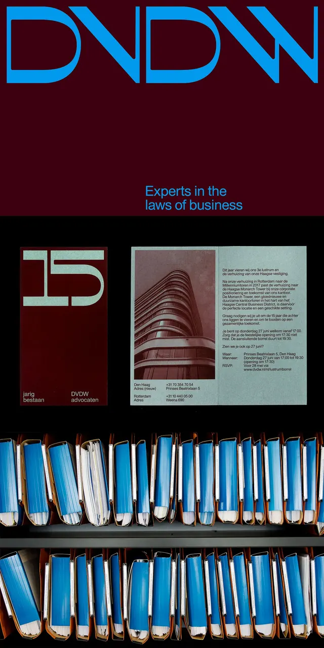
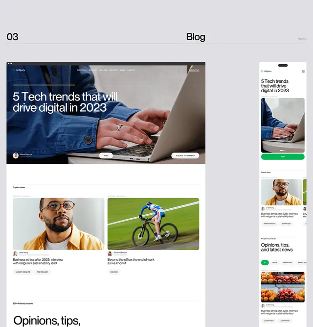
This design employs a strong contrast between deep, rich tones and vibrant blues to establish a professional and authoritative tone.
Summary
This design employs a strong contrast between deep, rich tones and vibrant blues to establish a professional and authoritative tone.
Visual description
This design employs a strong contrast between deep, rich tones and vibrant blues to establish a professional and authoritative tone. The composition is highly structured, using clear hierarchy through large typography and organized rows of physical objects to convey precision and expertise. The layout is highly organized, utilizing negative space and strong horizontal lines to create a sense of order and depth. Clean, bold sans-serif typefaces are used for high impact and readability.
Key takeaway
A type specimen reference. Worth saving for its corporate, minimalist, typographic treatment.
Reuse notes
Fits legal, b2b, media work.
More like this






Keep what you find
A free account saves references to boards and can send you a weekly email of picks based on what you save.
To see every result, go Pro.