Preview image. Unlock full-res
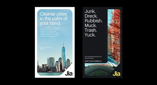
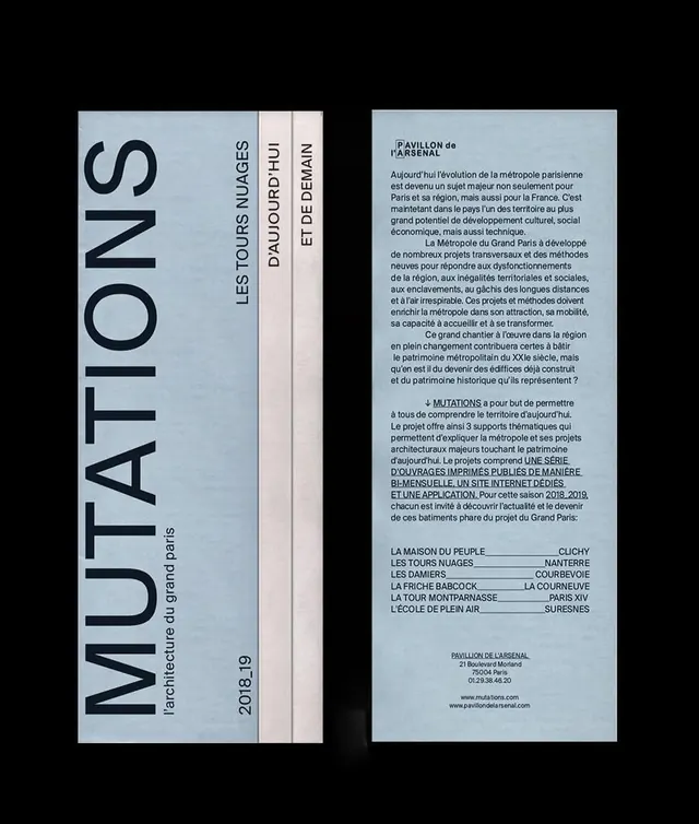
The image presents a stark, minimalist design contrasting two distinct concepts, cleanliness versus junk, using strong typography and negative space.
Summary
The image presents a stark, minimalist design contrasting two distinct concepts, cleanliness versus junk, using strong typography and negative space.
Visual description
The image presents a stark, minimalist design contrasting two distinct concepts, cleanliness versus junk, using strong typography and negative space. The layout is divided vertically, employing a clean white background for the first concept and a dark, textured background for the second, creating a clear visual dichotomy. The composition is a vertical split, balancing text blocks against large areas of negative space and texture. Sans-serif fonts are used, clean and highly legible, emphasizing the directness of the messaging.
Key takeaway
A type specimen reference. Worth saving for its minimalist, typographic, high-contrast treatment.
Reuse notes
Fits marketing work.
More like this

Keep what you find
A free account saves references to boards and can send you a weekly email of picks based on what you save.
To see every result, go Pro.