Preview image. Unlock full-res
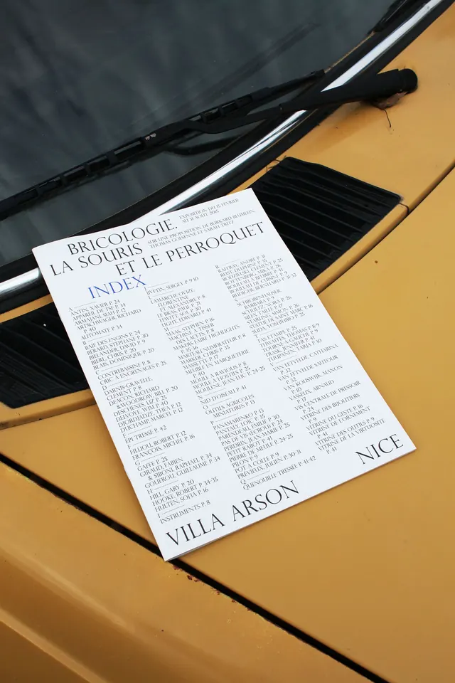
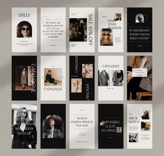
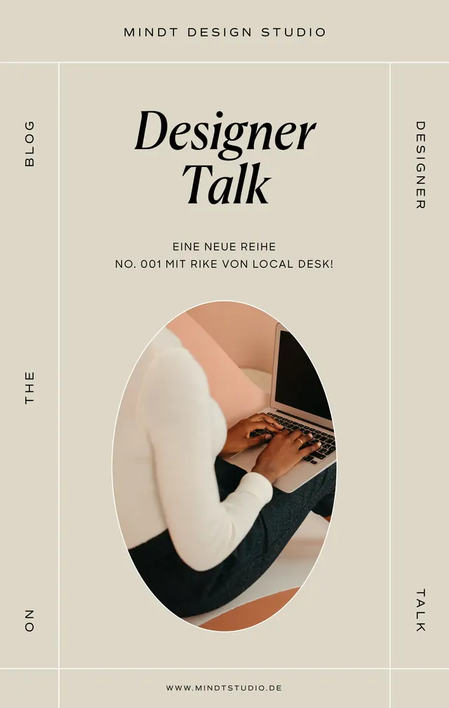
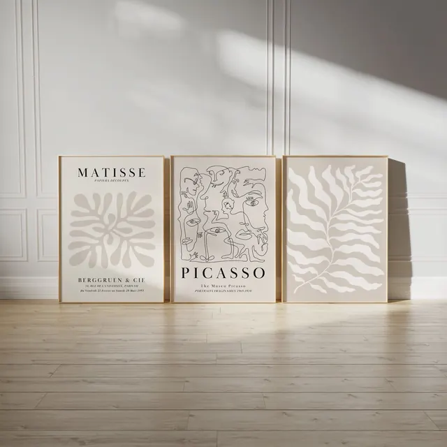
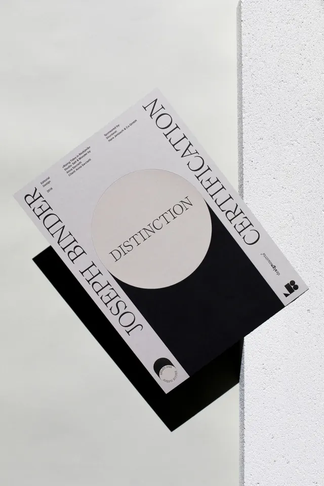
A minimalist poster with rotated serif typography, a large central circle, and stark black-and-off-white contrast.
Summary
A minimalist poster with rotated serif typography, a large central circle, and stark black-and-off-white contrast.
Visual description
A pale poster is shown at an angle, layered over a solid black square shape and a textured light wall. Large serif words run along the edges, with a centered off-white circle containing the word "DISTINCTION."
Key takeaway
Use a single dominant geometric form to anchor the composition, then let oversized rotated typography frame it. The restrained palette and generous negative space make the layout feel precise and expensive.
Reuse notes
Reach for this when the goal is a high-end editorial or awards-style print piece with strong typographic presence. It works best when you want minimal elements to feel architectural rather than sparse.