Preview image. Unlock full-res
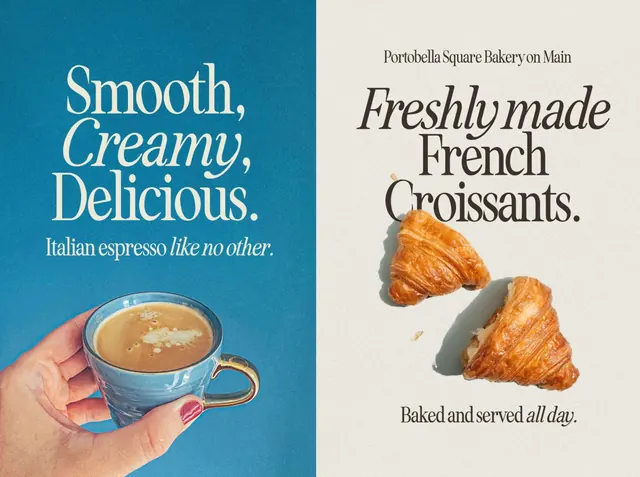
A two-panel bakery and coffee promotional poster uses oversized serif typography with product photography on contrasting blue and cream backgrounds.
Summary
A two-panel bakery and coffee promotional poster uses oversized serif typography with product photography on contrasting blue and cream backgrounds.
Visual description
The image is split vertically into two equal poster-style panels. The left side has a textured bright blue background with large cream serif text and a hand holding a blue espresso cup near the bottom; the right side has a warm off-white textured background with stacked dark serif text and two croissants arranged below it.
Key takeaway
Use large expressive serif type as the primary visual element, then pair it with a simple food object placed low in the frame for balance. The strong two-color split creates instant contrast and makes the composition feel like a premium print ad.
Reuse notes
Reach for this when promoting a food or beverage item and you want the typography to feel as important as the product. It works best when you have one hero object per panel and want a polished, editorial bakery-campaign look.