Preview image. Unlock full-res
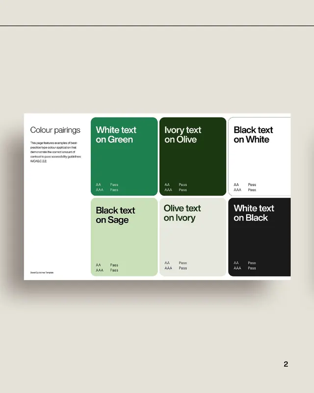
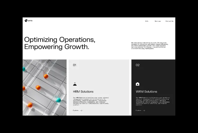
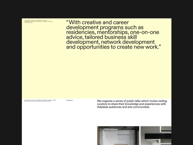
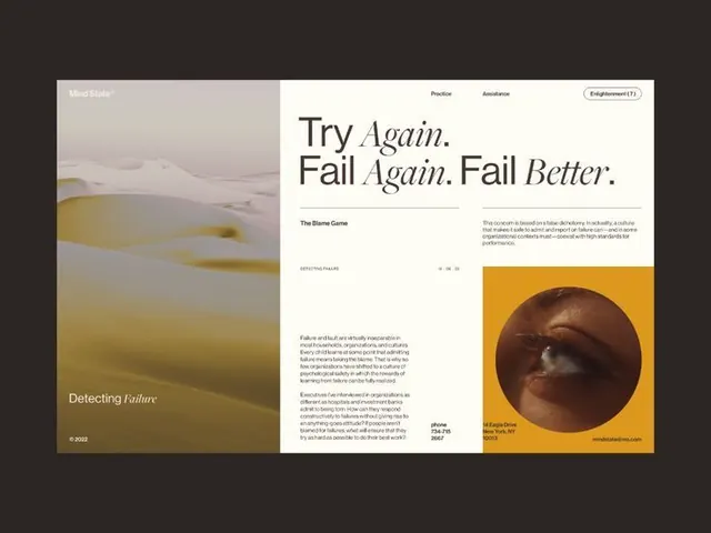
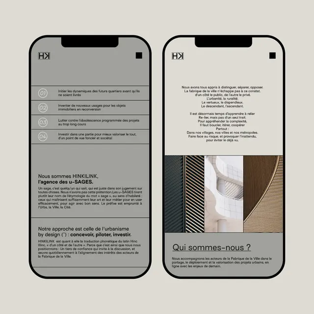
This design showcases a highly structured and minimalist approach to color contrast testing, utilizing clear modular blocks to demonstrate text legibility across various pairings.
Summary
This design showcases a highly structured and minimalist approach to color contrast testing, utilizing clear modular blocks to demonstrate text legibility across various pairings.
Visual description
This design showcases a highly structured and minimalist approach to color contrast testing, utilizing clear modular blocks to demonstrate text legibility across various pairings. The visual language is clean and professional, prioritizing readability and accessibility standards through thoughtful use of muted, earthy tones. The composition is highly modular and organized, using distinct rectangular blocks to separate and display different text color pairings efficiently. Clean, highly legible sans-serif typefaces are used throughout to ensure clarity and modern readability.
Key takeaway
A type specimen reference. Worth saving for its minimalist, corporate, accessible treatment.
Reuse notes
Fits general design work.
More like this



Keep what you find
A free account saves references to boards and can send you a weekly email of picks based on what you save.
To see every result, go Pro.