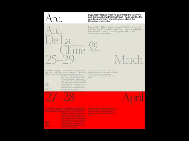
Preview image. Unlock full-res
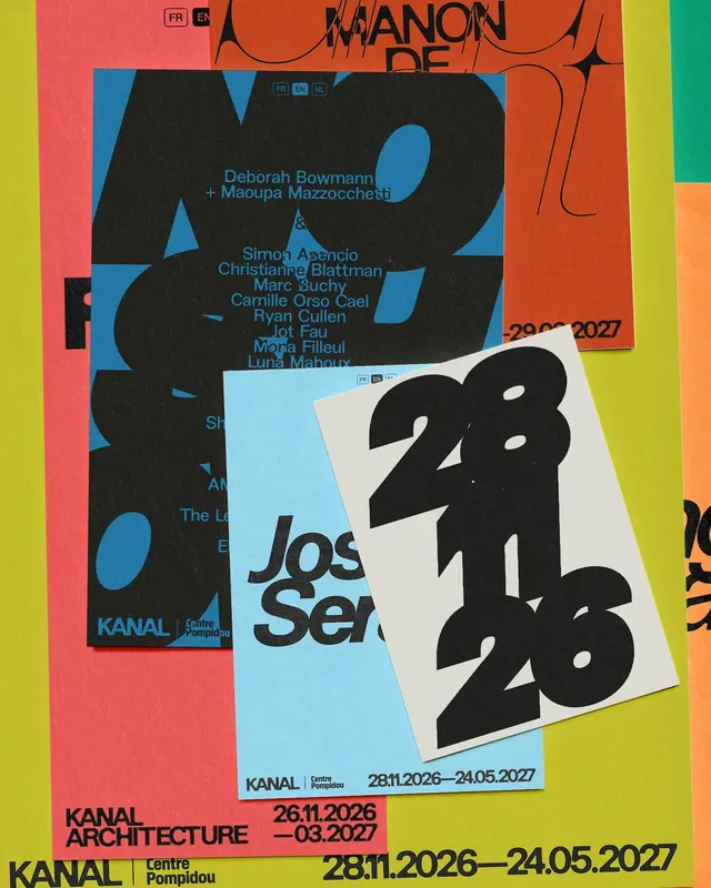
This design utilizes strong typographic hierarchy and severe minimalism, relying on stark contrast between black text and white space to create a highly structured and academic feel.
Summary
This design utilizes strong typographic hierarchy and severe minimalism, relying on stark contrast between black text and white space to create a highly structured and academic feel.
Visual description
This design utilizes strong typographic hierarchy and severe minimalism, relying on stark contrast between black text and white space to create a highly structured and academic feel. The clean lines and segregated sections guide the viewer through the information efficiently, resulting in a sophisticated and serious visual presentation. The composition is highly structured, using grid-like segmentation and ample negative space to balance large typographic elements across the frame. A clean, sans-serif typeface is used throughout, emphasizing readability and a modern aesthetic.
Key takeaway
A type specimen reference. Worth saving for its minimalism, monochromatic, typographic treatment.
Reuse notes
Fits general design work.
More like this


Keep what you find
A free account saves references to boards and can send you a weekly email of picks based on what you save.
To see every result, go Pro.