Preview image. Unlock full-res
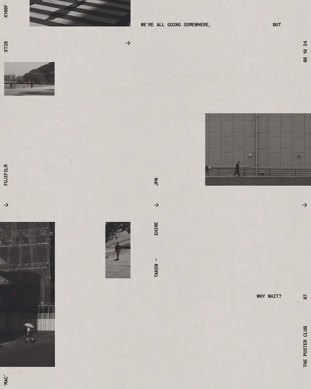
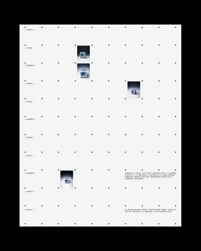
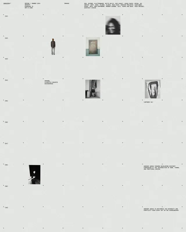
A high-contrast, minimalist editorial spread featuring a grid-based arrangement of architectural photography and small text elements.

Summary
A high-contrast, minimalist editorial spread featuring a grid-based arrangement of architectural photography and small text elements.
Visual description
The design uses a strict grid with large areas of white space, punctuated by small black-and-white photographs of industrial structures. Text is placed in the margins and corners, creating a balanced, airy composition.
Key takeaway
Use generous white space and a rigid grid to create a sophisticated, gallery-like aesthetic.
Reuse notes
Apply this layout for high-end portfolio presentations or minimalist magazine spreads.
More like this
Keep what you find
A free account saves references to boards and can send you a weekly email of picks based on what you save.
To see every result, go Pro.