Preview image. Unlock full-res
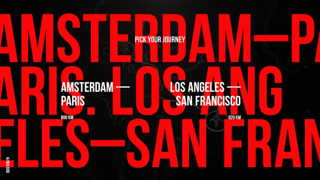
This design utilizes a stark, high-contrast aesthetic, employing bold typography and simple color blocking to present travel options clearly.
Summary
This design utilizes a stark, high-contrast aesthetic, employing bold typography and simple color blocking to present travel options clearly.
Visual description
This design utilizes a stark, high-contrast aesthetic, employing bold typography and simple color blocking to present travel options clearly. The visual language is direct and minimal, relying on powerful red against black to draw immediate attention to the destination pairings. The composition is linear and hierarchical, stacking geographical routes vertically across the frame for easy reading. A clean, bold, capitalized sans-serif typeface is used for maximum legibility and impact.
Key takeaway
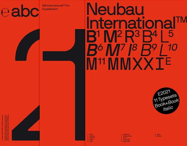
A type specimen reference. Worth saving for its high contrast, minimalist, modern treatment.
Reuse notes
Fits travel, marketing work.
More like this
Keep what you find
A free account saves references to boards and can send you a weekly email of picks based on what you save.
To see every result, go Pro.