Preview image. Unlock full-res
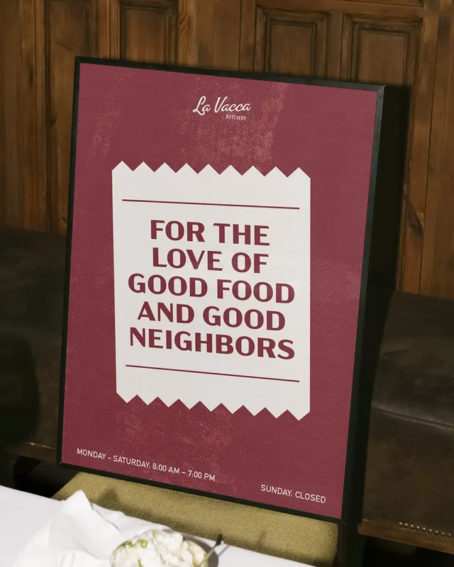
This design employs a classic, rustic aesthetic using deep reds and off-white to convey a sense of established quality and warmth.
Summary
This design employs a classic, rustic aesthetic using deep reds and off-white to convey a sense of established quality and warmth.
Visual description
This design employs a classic, rustic aesthetic using deep reds and off-white to convey a sense of established quality and warmth. The composition is clean and highly structured, creating a clear visual hierarchy that effectively communicates the business name and event details. The overall feeling is inviting, traditional, and focused on community and good food. The information is centrally organized within a rectangular frame, utilizing negative space effectively to draw attention to the main message. Clear, bold serif fonts are used for titles and body text, lending a formal and readable appearance.
Key takeaway
An editorial spread reference. Worth saving for its classic, rustic, traditional treatment.
Reuse notes
Fits general design work.
More like this
Keep what you find
A free account saves references to boards and can send you a weekly email of picks based on what you save.
To see every result, go Pro.