Preview image. Unlock full-res
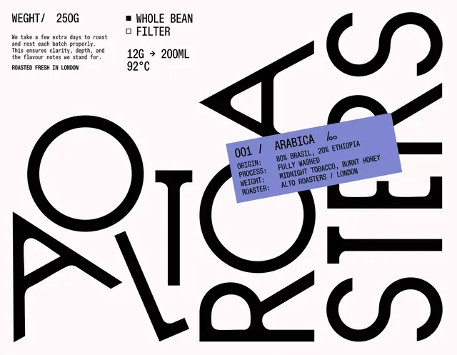
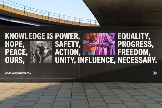
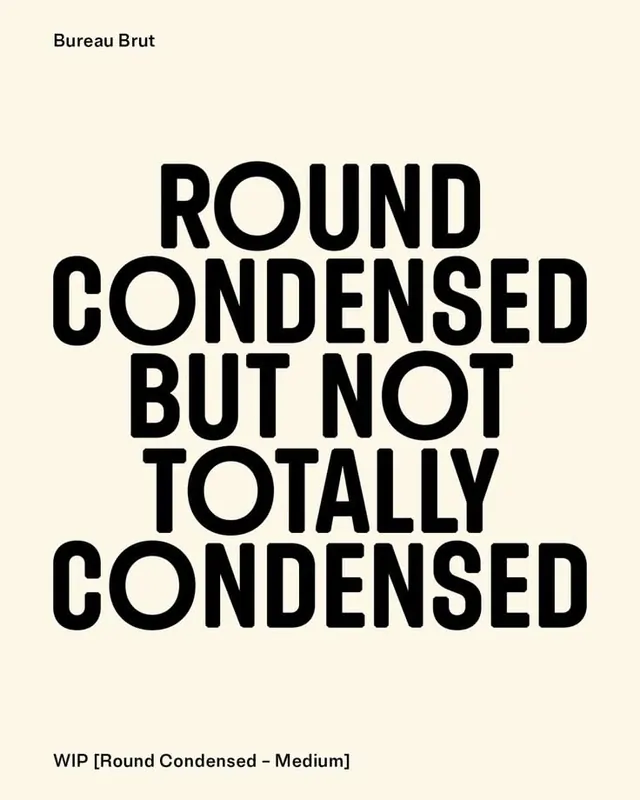
The design utilizes a stark, high-contrast visual language dominated by heavy typography and negative space to convey professionalism and artisanal quality.
Summary
The design utilizes a stark, high-contrast visual language dominated by heavy typography and negative space to convey professionalism and artisanal quality.
Visual description
The design utilizes a stark, high-contrast visual language dominated by heavy typography and negative space to convey professionalism and artisanal quality. The layout is graphic and fragmented, blending functional information with a strong, bold aesthetic that suggests premium, carefully crafted products. The composition relies on large, monolithic letters to establish a strong visual structure, with specific product details placed within designated blocks. Heavy, blocky sans-serif typefaces are used to create a powerful and assertive presence.
Key takeaway
A type specimen reference. Worth saving for its minimalist, high contrast, brutalist treatment.
Reuse notes
Fits general design work.
More like this
Keep what you find
A free account saves references to boards and can send you a weekly email of picks based on what you save.
To see every result, go Pro.