
Preview image. Unlock full-res
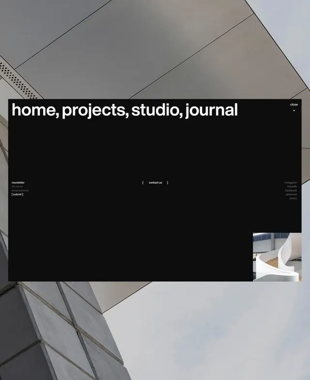
This interface utilizes a dark mode aesthetic emphasizing clarity and focus through high contrast.
Summary
This interface utilizes a dark mode aesthetic emphasizing clarity and focus through high contrast.
Visual description
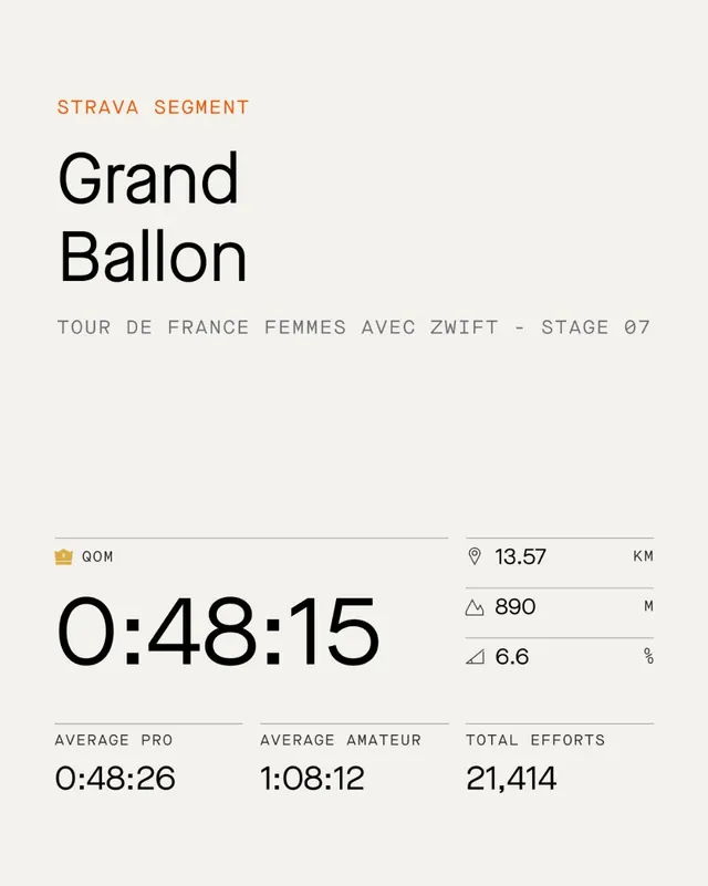
This interface utilizes a dark mode aesthetic emphasizing clarity and focus through high contrast. The design is minimalist, employing clean lines and subtle color accents to ensure key information stands out against the deep background. The composition is vertically stacked, separating the main feature text from utility icons and secondary scheduling information. Clean sans-serif fonts are used for both headings and body text.
Key takeaway
A type specimen reference. Worth saving for its dark mode, minimalist, clean ui treatment.
Reuse notes
Fits productivity work.
More like this

Keep what you find
A free account saves references to boards and can send you a weekly email of picks based on what you save.
To see every result, go Pro.