Preview image. Unlock full-res
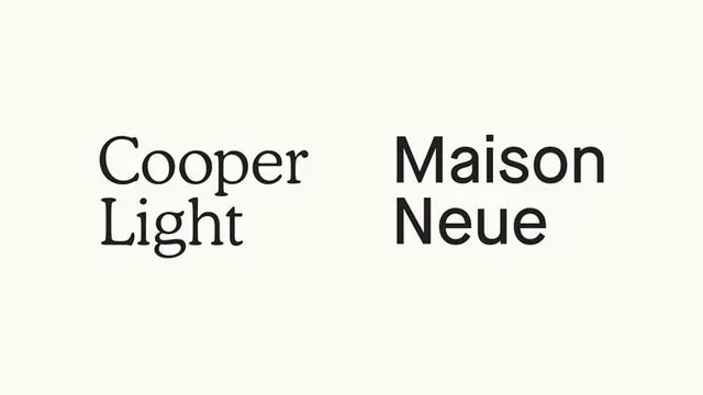
A minimalist typographic composition featuring two contrasting typeface specimens displayed side-by-side against a neutral cream background.
Summary
A minimalist typographic composition featuring two contrasting typeface specimens displayed side-by-side against a neutral cream background.
Visual description
A minimalist typographic composition featuring two contrasting typeface specimens displayed side-by-side against a neutral cream background. The design emphasizes clean typography and font comparison through a balanced, symmetrical layout that highlights the distinct characteristics of each typeface. Two-column symmetric arrangement with left-aligned text blocks separated by negative space, creating visual balance and clear hierarchy. Cooper Light (serif-influenced, lighter weight) on left; Maison Neue (geometric sans-serif, bold weight) on right, demonstrating font contrast and legibility.
Key takeaway
A type specimen reference. Worth saving for its minimalist, typographic, contemporary treatment.
Reuse notes
Fits general design work.
More like this
Keep what you find
A free account saves references to boards and can send you a weekly email of picks based on what you save.
To see every result, go Pro.