Preview image. Unlock full-res
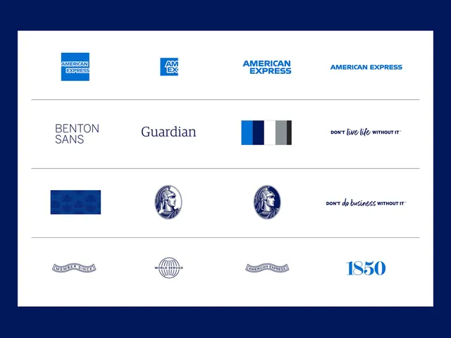
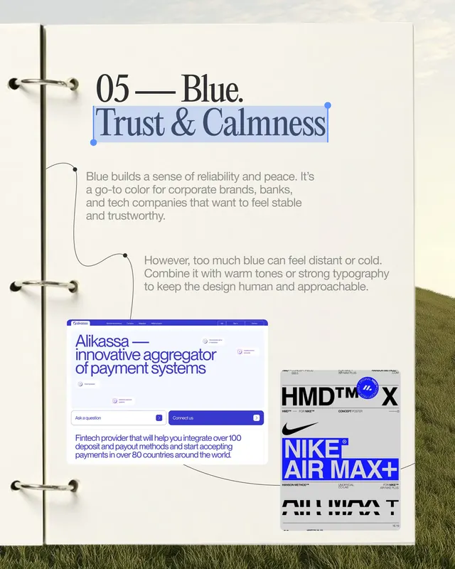
This design utilizes a clean, minimalist layout to present a comparison of various entities, relying heavily on typography and simple geometric icons.
Summary
This design utilizes a clean, minimalist layout to present a comparison of various entities, relying heavily on typography and simple geometric icons.
Visual description
This design utilizes a clean, minimalist layout to present a comparison of various entities, relying heavily on typography and simple geometric icons. The visual language is highly structured, emphasizing clarity, organization, and a professional corporate feel. The composition is a highly organized, row-based list structure designed for easy comparison and scanning. Clean, legible sans-serif typefaces are used throughout to maintain a modern and professional tone.
Key takeaway
A type specimen reference. Worth saving for its minimalist, corporate, clean treatment.
Reuse notes
Fits fintech work.
More like this

Keep what you find
A free account saves references to boards and can send you a weekly email of picks based on what you save.
To see every result, go Pro.