Preview image. Unlock full-res
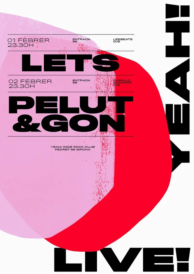
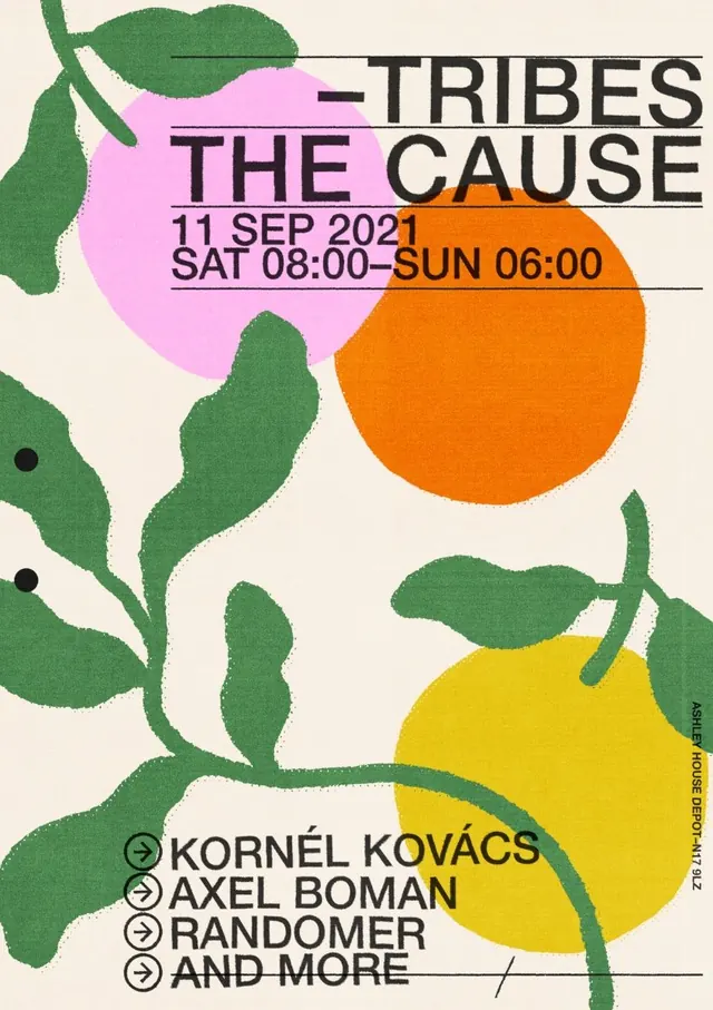
A graphic event poster with oversized black typography over layered hand-painted circular and leaf-like shapes on a warm cream background.
Summary
A graphic event poster with oversized black typography over layered hand-painted circular and leaf-like shapes on a warm cream background.
Visual description
The image shows a vertically oriented poster on a cream background with large black headline text near the top reading 'TRIBES THE CAUSE' and smaller date/time text beneath it. Large painted green leaf-like forms and bright circular color blocks in pink, orange, and yellow overlap across the page, with thin horizontal rules separating the text sections and a vertical line of small text along the right edge.
Key takeaway
Use oversized sans-serif type layered over organic painted shapes to create tension between structure and spontaneity. Thin divider lines and asymmetrical overlap help the composition feel editorial without becoming cluttered.
Reuse notes
Reach for this when you want an event or campaign poster to feel handmade, energetic, and print-forward. It works best when the typography can stay minimal and the color palette is limited to a few strong accents on a light base.