Preview image. Unlock full-res
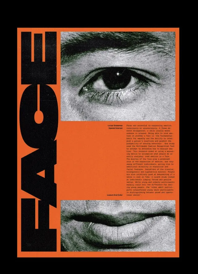
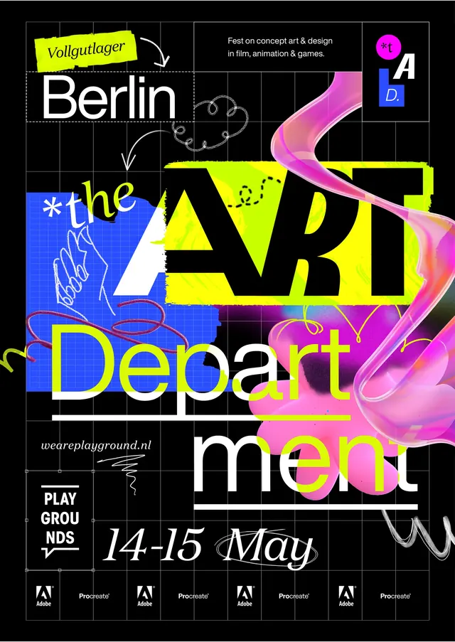
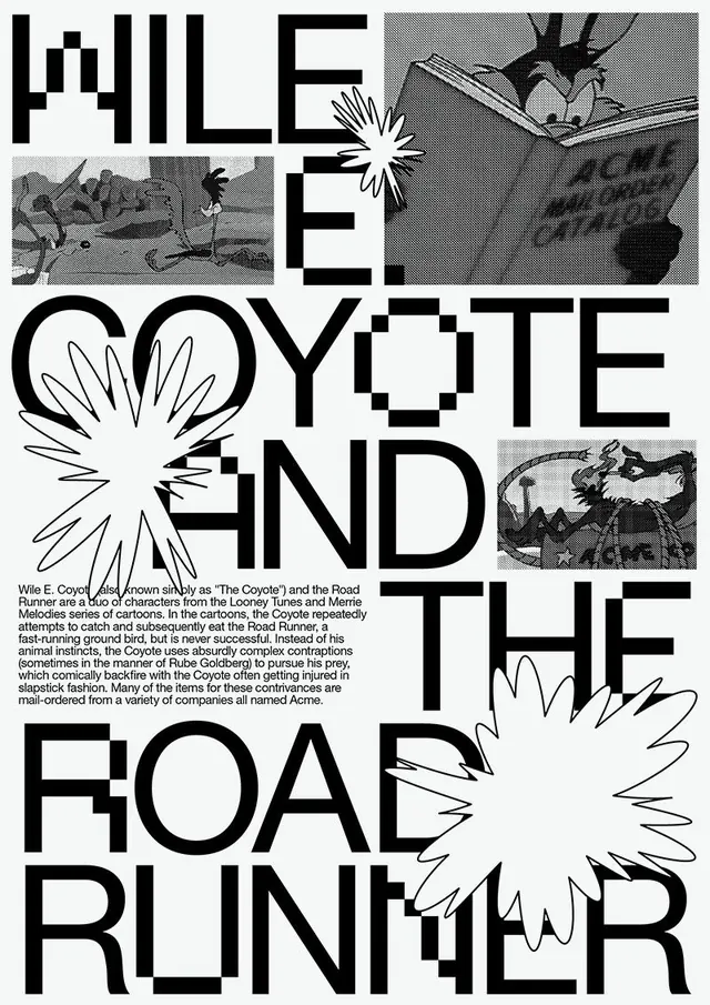
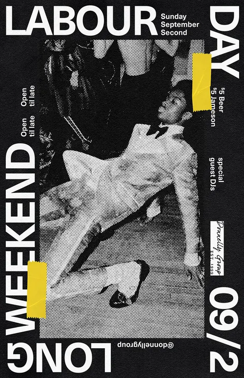
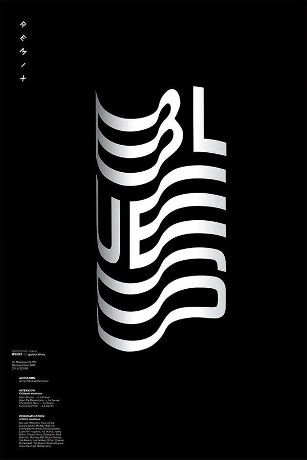
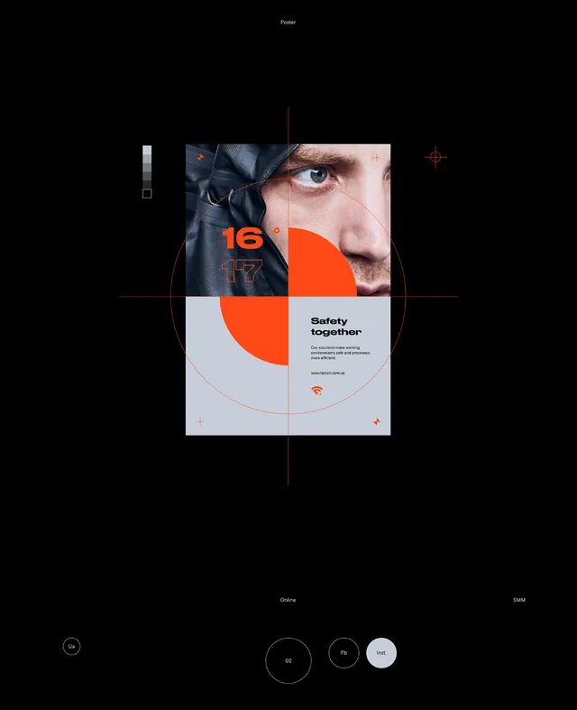
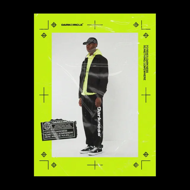
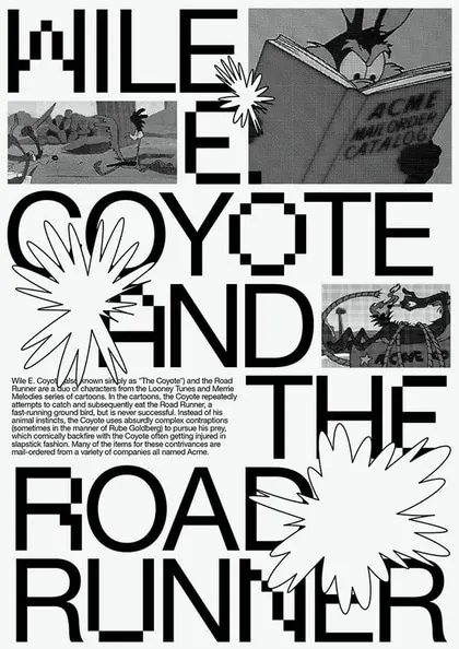
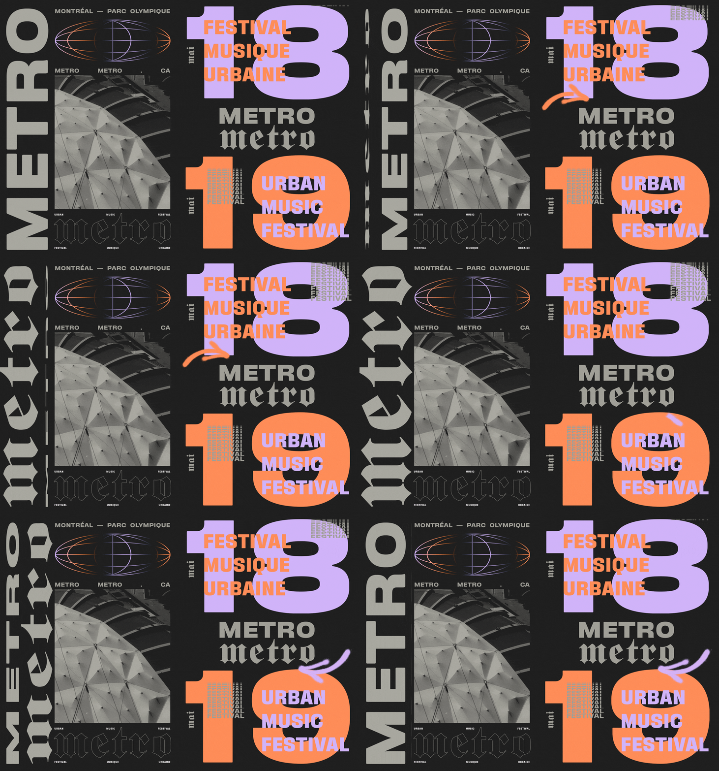
A dark festival poster combines oversized typography, grayscale architecture photography, and neon gradient type on an asymmetrical grid.
Summary
A dark festival poster combines oversized typography, grayscale architecture photography, and neon gradient type on an asymmetrical grid.
Visual description
The composition sits on a nearly black background with a huge vertical word on the left, a large grayscale architectural photo in the lower-left center, and oversized pastel numerals and orange headlines on the right. Small supporting labels and decorative type treatments are scattered throughout, including a wireframe oval graphic near the top and stacked festival text blocks near the lower right.
Key takeaway
Use one dominant typographic gesture to anchor the page, then layer secondary content around it with strong scale contrast. Mix monochrome imagery with one or two bright accent gradients to create a loud but controlled poster system.
Reuse notes
Reach for this when you need a high-impact event poster or editorial cover that has to feel contemporary and dense without losing hierarchy. It works best when the content is short and can tolerate aggressive overlap and oversized type.