Preview image. Unlock full-res
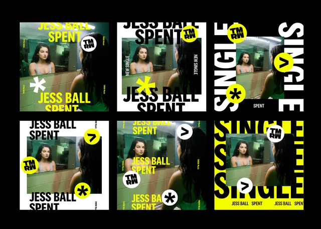
A collage of multiple poster layouts for Jess Ball's single \"Spent\" using bold black, white, and neon yellow typography over a photographic image.
Summary
A collage of multiple poster layouts for Jess Ball's single "Spent" using bold black, white, and neon yellow typography over a photographic image.
Visual description
The image shows a 2x3 grid of poster mockups featuring the same portrait photo of a woman in a bathroom mirror scene. Each variation rearranges oversized all-caps text, cropped type, and circular logo marks in black, white, and neon yellow against a black background. Some posters use white frames or full-bleed photo placement, while others stack the title around the image in a dense, graphic composition.
Key takeaway
Use one strong photo and build multiple poster systems by aggressively varying crop, scale, and text placement around it. The neon yellow circles and oversized condensed type create a clear identity even when the layout changes.
Reuse notes
Reach for this when you need a music-promo or event campaign that should feel punchy, modular, and easy to adapt across formats. It works best when the photo can handle heavy typography and repeated use without losing impact.