Preview image. Unlock full-res
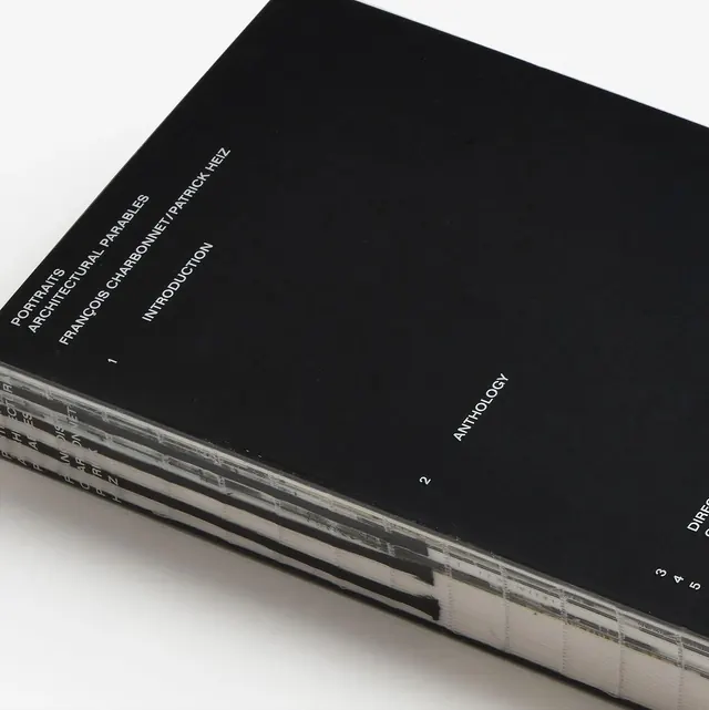
A stack of black and white publications featuring clean typography and a structured grid.
Styleminimal, swiss, monochrome, corporate-clean
Colormonochrome
Typesans-serif, all-caps, condensed
Moodprofessional, elegant, technical
Palette
#262626
#D9D8D7

Summary
A stack of black and white publications featuring clean typography and a structured grid.
Visual description
A stack of black books with white sans-serif text aligned to the edges. The spines feature repeated vertical text and numbering in a structured, grid-like arrangement.
Key takeaway
The design emphasizes high-contrast typography and strict alignment to create a sophisticated, organized aesthetic.
Reuse notes
Apply this high-contrast, grid-based typographic layout for corporate reports or portfolio books.
More like this



Keep what you find
A free account saves references to boards and can send you a weekly email of picks based on what you save.
To see every result, go Pro.