Preview image. Unlock full-res
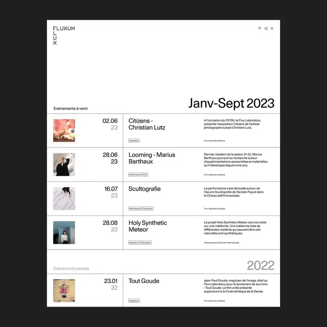
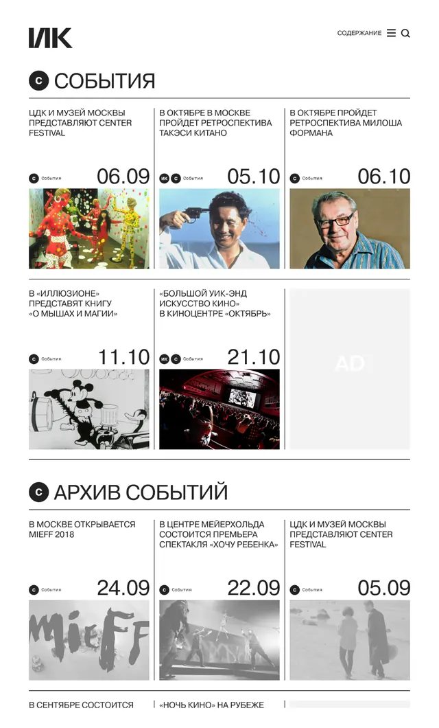
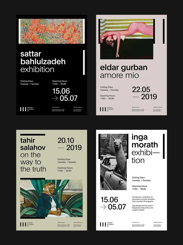
This design utilizes a stark, high-contrast visual language dominated by black and white to present organized event scheduling.
Summary
This design utilizes a stark, high-contrast visual language dominated by black and white to present organized event scheduling.
Visual description
This design utilizes a stark, high-contrast visual language dominated by black and white to present organized event scheduling. The aesthetic is highly minimalist, focusing entirely on readability and functional organization for a professional calendar or program. The composition is vertically oriented, employing a clear list structure with ample negative space to ensure every piece of information is easily digestible. A clean, legible sans-serif typeface is used throughout, emphasizing clarity and modern precision.
Key takeaway
An editorial spread reference. Worth saving for its minimalist, modern, high-contrast treatment.
Reuse notes
Fits general design work.
More like this


Keep what you find
A free account saves references to boards and can send you a weekly email of picks based on what you save.
To see every result, go Pro.