Preview image. Unlock full-res
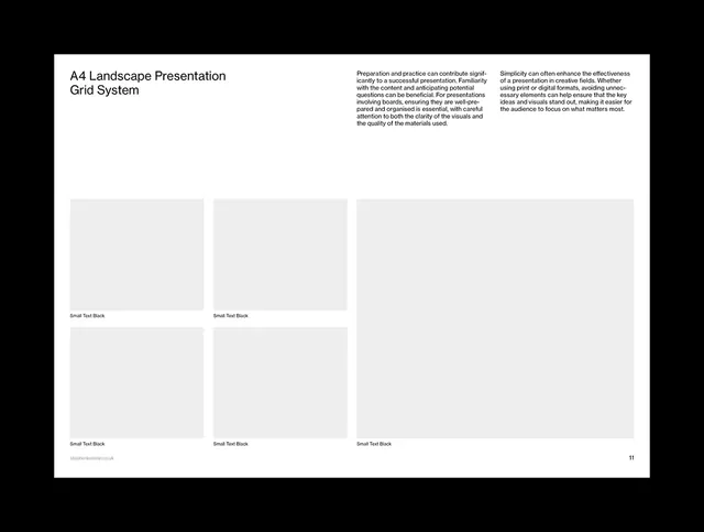
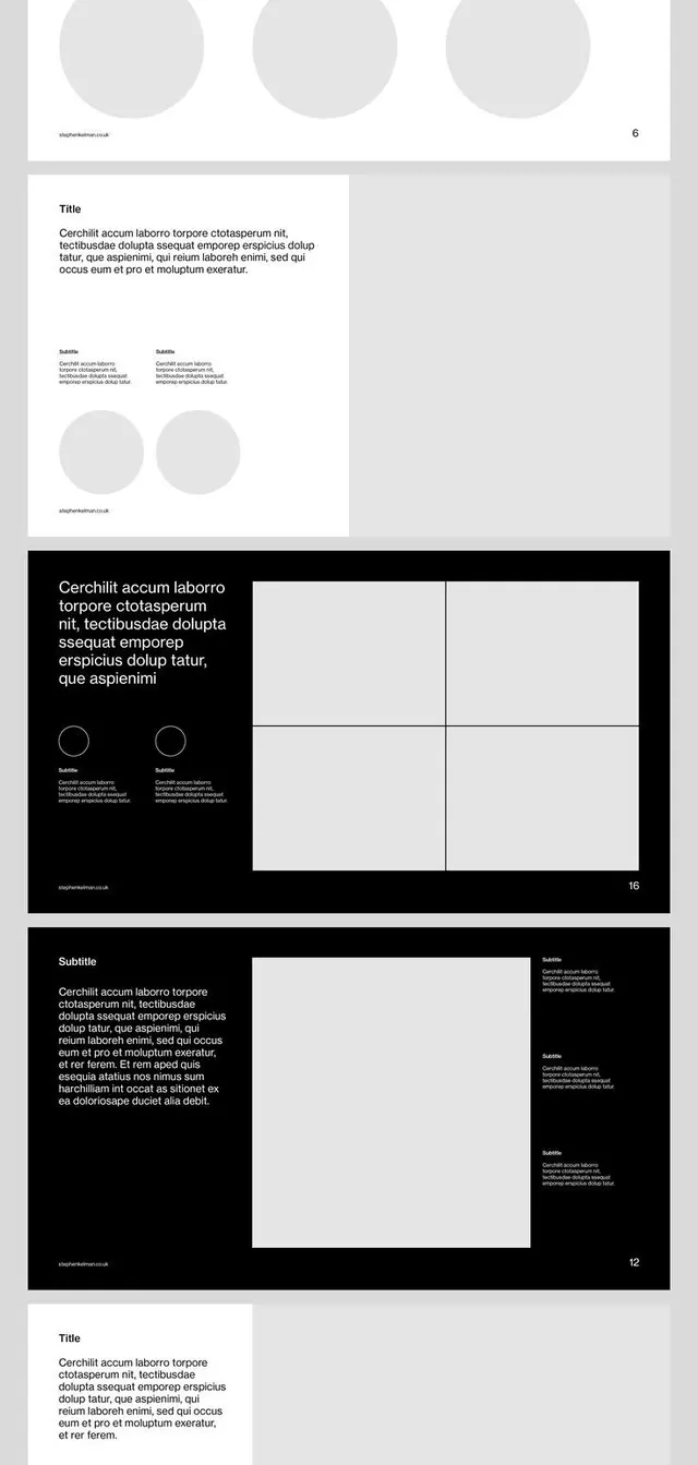
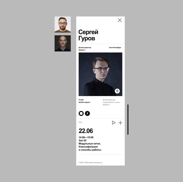
This design showcases a highly structured and minimalist approach to presentation layout, emphasizing grid systems and ample negative space.
Summary
This design showcases a highly structured and minimalist approach to presentation layout, emphasizing grid systems and ample negative space.
Visual description
This design showcases a highly structured and minimalist approach to presentation layout, emphasizing grid systems and ample negative space. The visual language is clean, professional, and systematic, designed to prioritize clarity and the organization of complex information. The overall feel is academic and highly organized. The composition is defined by a strict, modular grid system utilizing large, empty rectangular placeholders to ensure visual balance and systematic content placement. A highly legible, clean sans-serif typeface is used for titles and labels, prioritizing readability over decorative flair.
Key takeaway
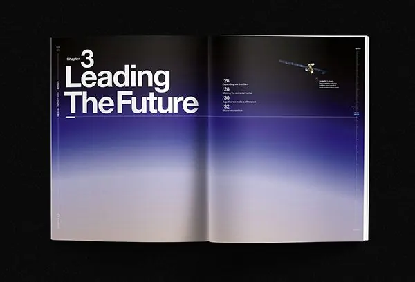
An editorial spread reference. Worth saving for its minimalist, grid, clean treatment.
Reuse notes
Fits general design work.
More like this

Keep what you find
A free account saves references to boards and can send you a weekly email of picks based on what you save.
To see every result, go Pro.