Preview image. Unlock full-res
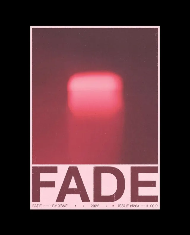
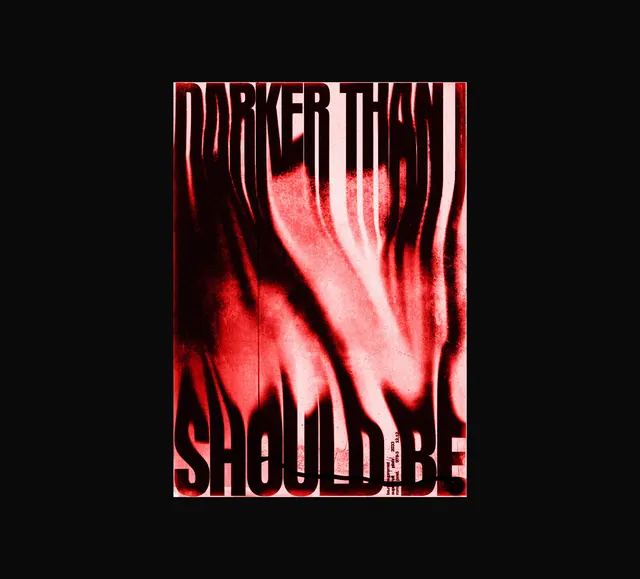
A high-contrast, distorted graphic featuring bold typography overlaid on a red and black abstract visual.
Stylebrutalist, maximalist, abstract
Colorhigh-contrast, dark
Typesans-serif, oversized, all-caps
Palette
#0F0909
#F29B9B
#C71C1C
Summary
A high-contrast, distorted graphic featuring bold typography overlaid on a red and black abstract visual.
Visual description
The design features the words 'DARKER THAN IT SHOULD BE' in a heavy, white sans-serif font. The background is a vibrant red and black abstract texture with vertical, liquid-like distortions.
Key takeaway
The design uses extreme contrast and distorted textures to create a high-impact, aggressive visual statement.
Reuse notes
Can be used as a social media header, album cover, or edgy promotional poster.