Preview image. Unlock full-res
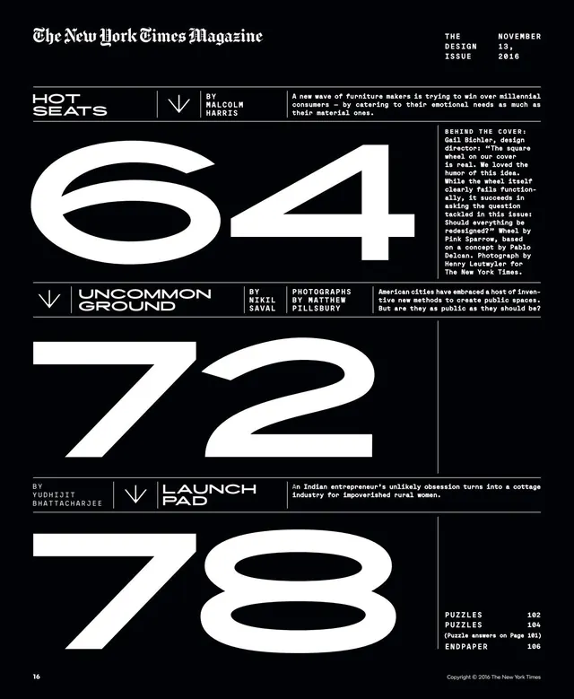
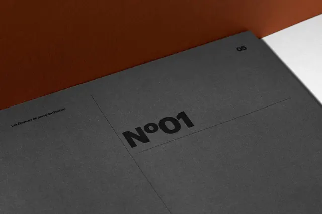
A high-contrast editorial layout featuring large, bold numerical figures paired with minimalist text blocks and thin horizontal dividers.
Summary
A high-contrast editorial layout featuring large, bold numerical figures paired with minimalist text blocks and thin horizontal dividers.
Visual description
The design features large, bold serif numbers (64, 72, 78) as primary focal points. Each section is organized with clean horizontal lines, small sans-serif headers, and justified blocks of serif body text.
Key takeaway
The layout demonstrates how extreme scale contrast and generous white space can create a sophisticated, authoritative editorial hierarchy.
Reuse notes
Apply this high-contrast numerical scaling and horizontal rule system to data-heavy reports or magazine layouts.
More like this


Keep what you find
A free account saves references to boards and can send you a weekly email of picks based on what you save.
To see every result, go Pro.