Preview image. Unlock full-res
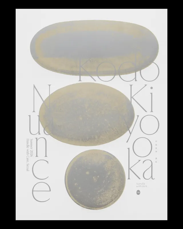
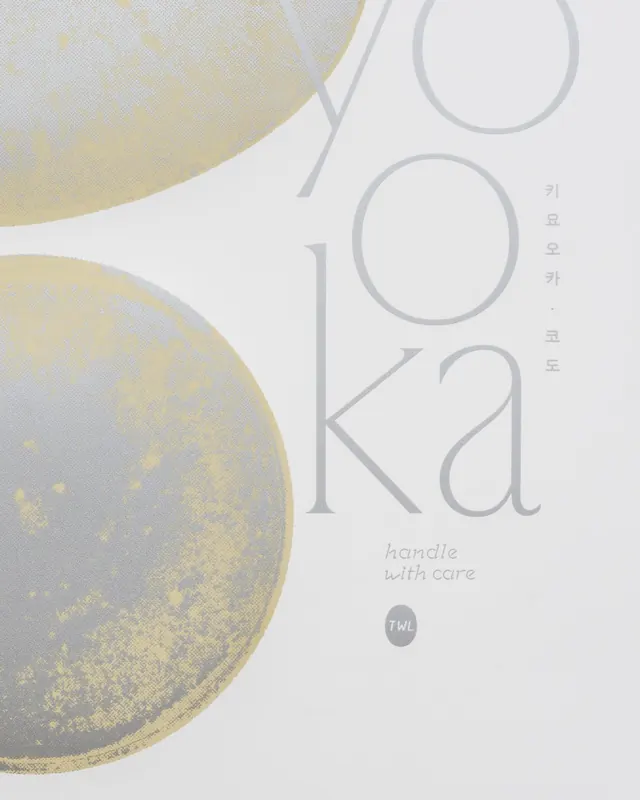
Minimalist screen-printed exhibition poster for Korean ceramic artist Kiyo Oka, layering organic clay forms with subtle typography.
Summary
A minimalist exhibition poster for a Korean pottery show, using layered photographic imagery of ceramic forms overlaid with condensed sans-serif typography. The design balances organic, hand-made clay with precise geometric type.
Visual description
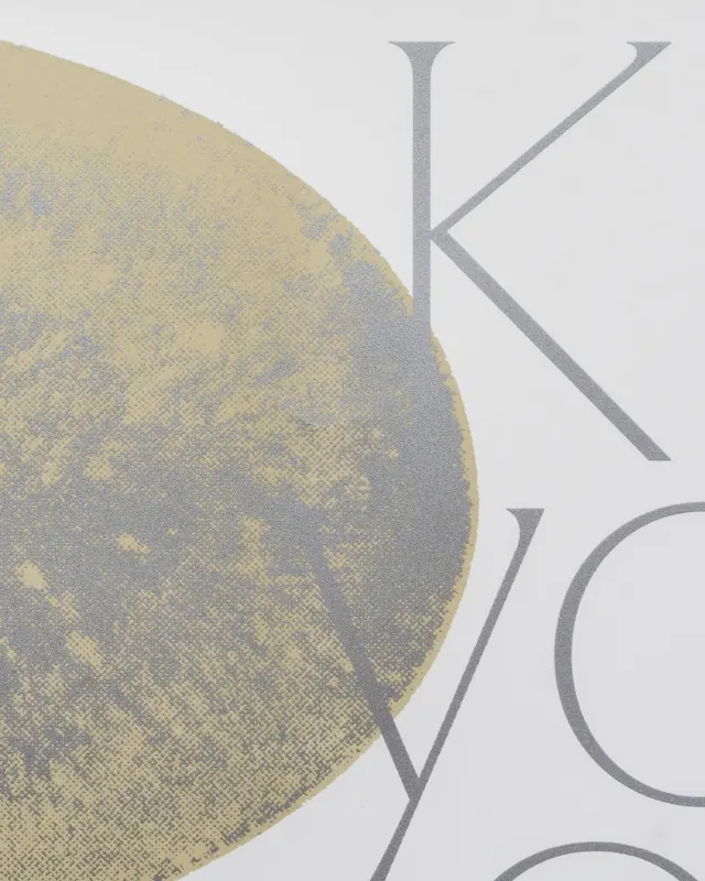
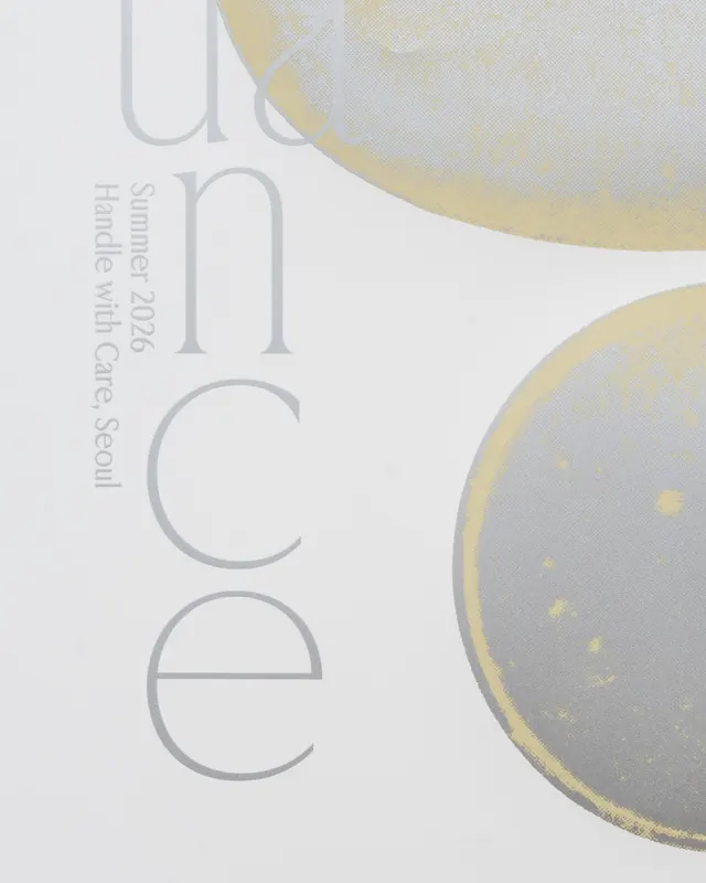
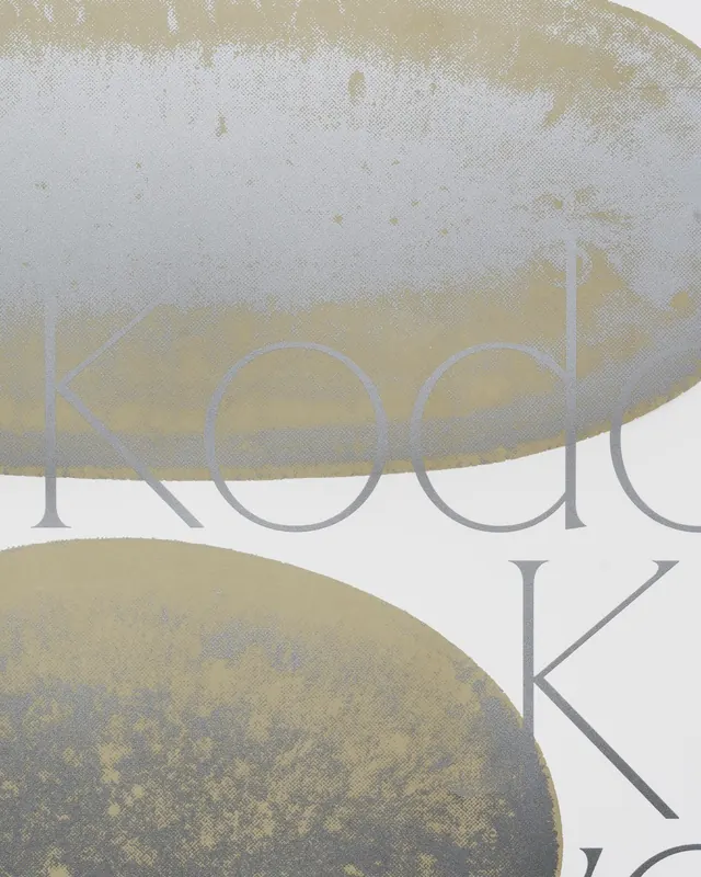
A light gray and cream poster featuring three photographs of oval ceramic forms positioned vertically. The pots are shot at various angles, full frontal view, close-up detail, partial crop, revealing subtle surface texture and shadows. Overlaid typography in a narrow, italic sans-serif reads "Nuance" in a large size with "Kiyo Oka" and event details in smaller text. The typography is loosely distributed, creating negative space around the ceramic imagery. Additional frames show close-up shots of the physical poster and printed collateral, revealing the screen-print texture and tactile quality of the execution.
Key takeaway
The pairing of organic, tactile photography with restrained, geometric typography. The use of whitespace and subtle earth tones to let the craft of the ceramics speak. The iteration across multiple materials and aspect ratios shows how a single design concept scales from poster to social media to in-venue collateral.
Reuse notes
Strong template for exhibition and craft-focused design, especially ceramics, textiles, or jewelry. Works best when the product/artwork is inherently beautiful and minimal; the typography should defer to the imagery. Screen printing adds genuine value here, the texture is visible in the close-ups and builds trust with craft-conscious audiences. Suited to independent galleries and designer-maker studios. One frame is a video close-up showing textural detail.
From this post: Nuance pottery exhibition poster and collateral
View post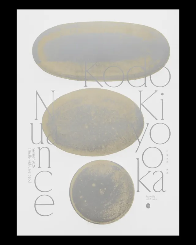
More like this

Keep what you find
A free account saves references to boards and can send you a weekly email of picks based on what you save.
To see every result, go Pro.