Preview image. Unlock full-res
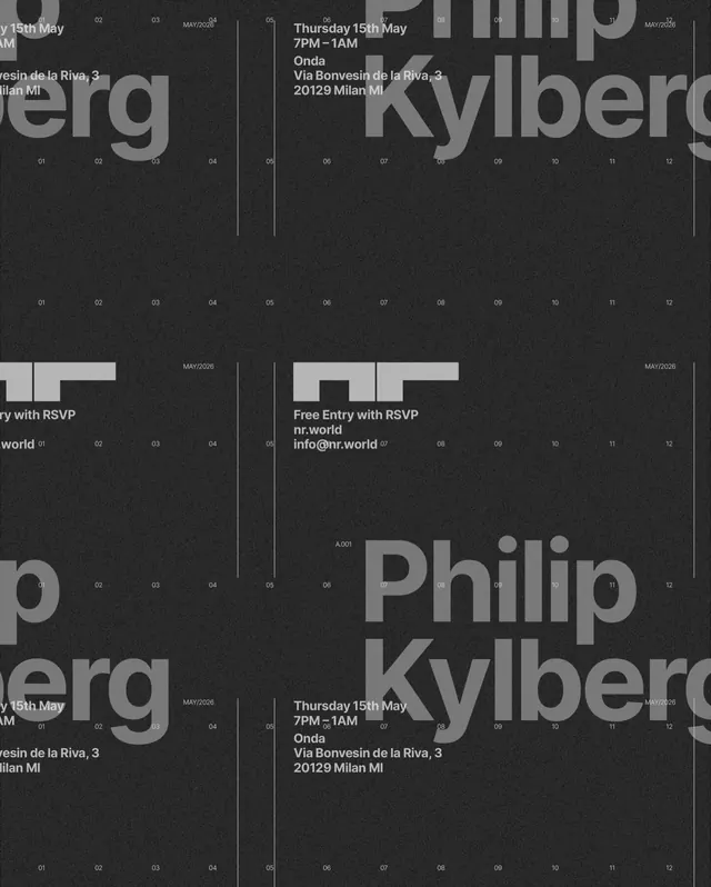
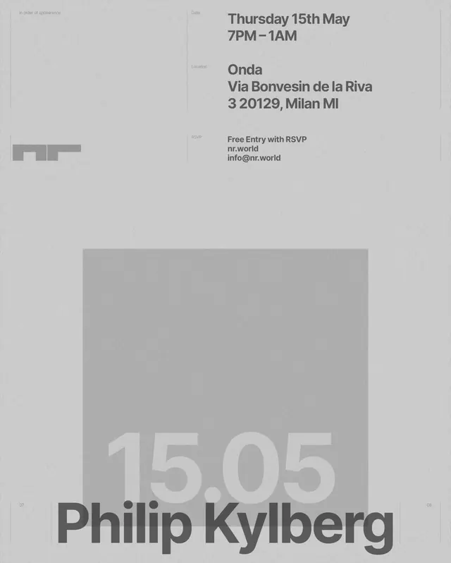
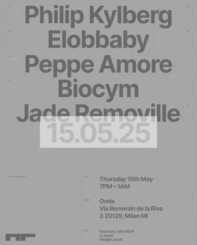
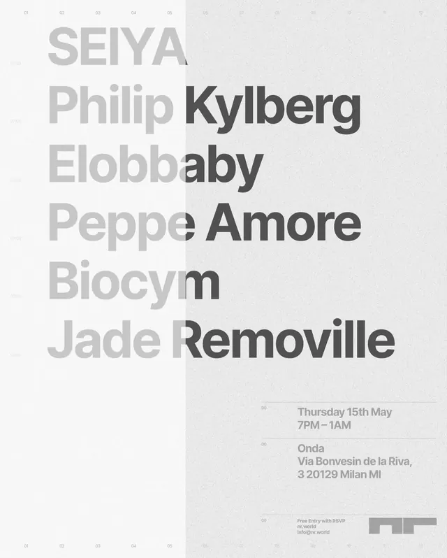
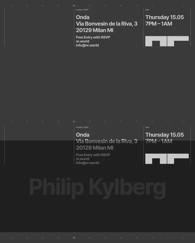
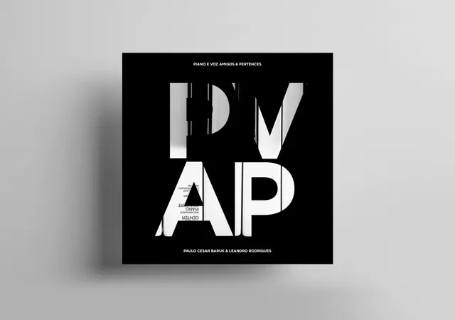
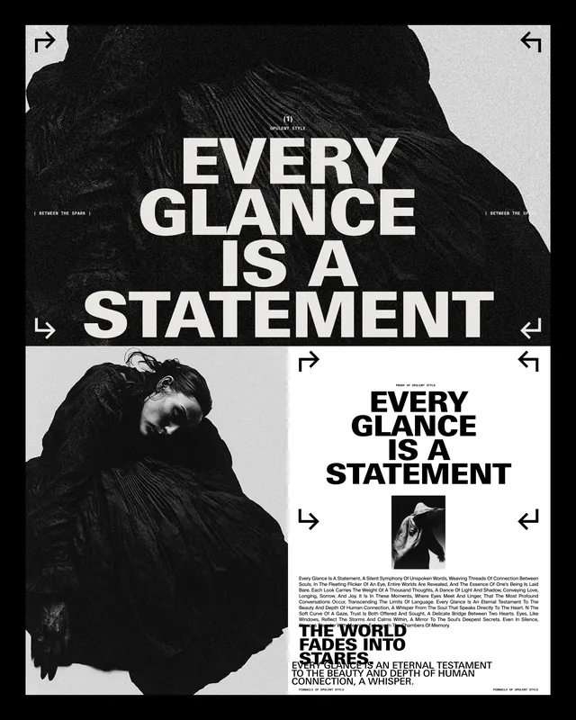
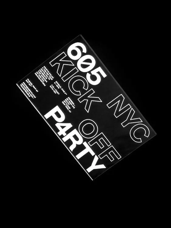
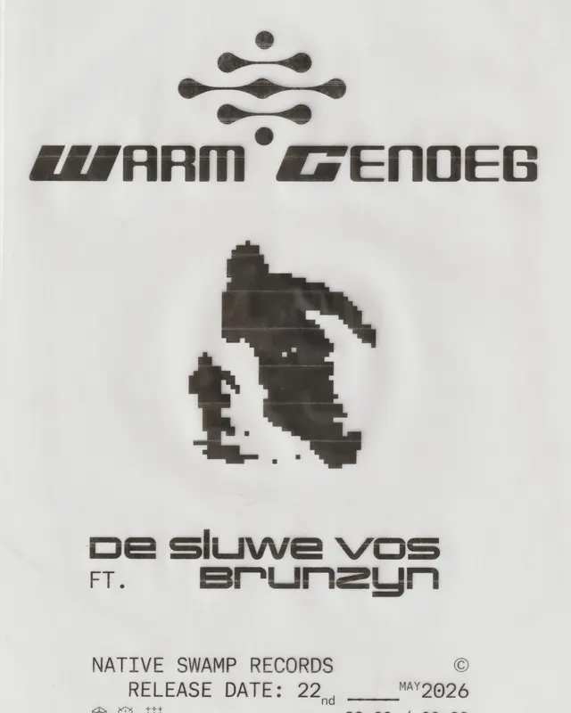
Multi-slide event poster design for an art/music event in Milan (May 2026) built on overlapping typography, high contrast, and modular grid layouts featuring performer names and event details.

Summary
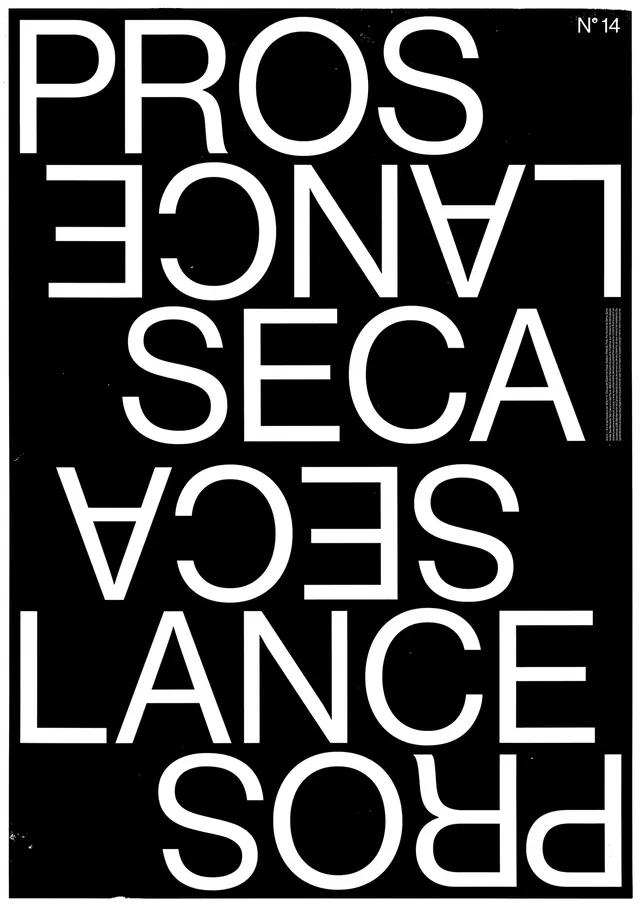
A modular event poster system for a May 2026 Milan nightlife event, built on stark typographic contrast and overlapping text, combining light and dark color blocks with performer names layered at varying scales and angles to create rhythm and visual depth.
Visual description
Slides show variations of a core layout: cream and dark gray/charcoal color-blocked sections with text layered densely. Large performer names (Philip Kylberg, Elobbaby, Peppe Amore) in bold sans-serif are often run in multiple weights or reversed (light on dark, dark on light). Event details-date (15th May), time (7PM–1AM), venue (Onda, Via Bonvesin de la Riva 3, Milan), and contact info (nr.world, info@nr.world)-repeat across slides in smaller type. Several slides introduce a numbered grid (01, 02, 03, etc.) suggesting a modular, sequential system. The first video frame shows motion applied to these elements. Overall approach is brutalist and editorial, with deliberate typography and no illustrative elements.
Key takeaway
Typographic layering and contrast can create visual interest and motion without imagery. The repeated performer names across slides act like a rhythm, building familiarity with the lineup. The color-block approach is economical (cream and charcoal print) while feeling bold and high-design.
Reuse notes
Ideal for art events, music festivals, cultural happenings, or editorial campaigns. Works well printed or digital. The modular system allows flexibility-different performer combinations and venue details can slot in without redesigning. Best for audiences that appreciate bold typography and experimental design. The high contrast reads well at small sizes (digital promotion) and stands out on a poster or billboard.