Preview image. Unlock full-res
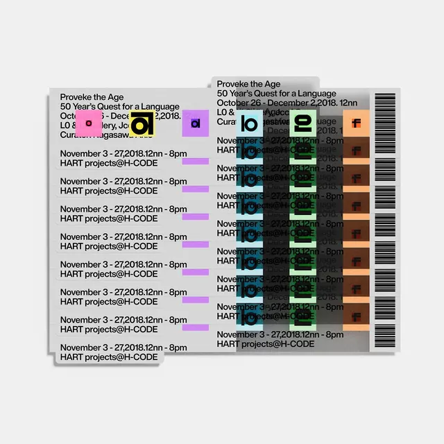
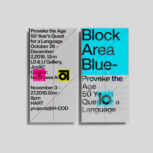
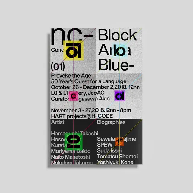
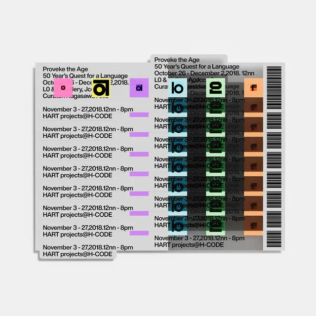
A three-slide carousel showing typographic event design and exhibition posters with layered text, color blocking, and calendar-based visual information for a language and art exhibition.

Summary
An exhibition identity system for "Provoke the Age: 50 Year's Quest for a Language"-a photography and art exhibition from 2018-using dense, overlapping typographic information, neon color blocks, and poster-within-poster composition to convey complexity, curation, and cultural depth.
Visual description
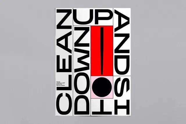
Slide 1 is a complex layered poster with repeating event text (title, dates, venue, curators) in black sans-serif, overprinted with bright neon color blocks in magenta, cyan, yellow, and green, creating visual collision and depth. The composition feels chaotic by design-information piles on itself, creating a sense of abundance and discovery. Slides 2 and 3 show variations with magazine-spread and additional poster treatments, maintaining the color-block strategy and dense typography. Text reads vertically, horizontally, and diagonally. The overall effect is contemporary art exhibition meets graphic design publication-approachable but intentionally challenging.
Key takeaway
Layering and visual noise as communication strategy-the overwhelming amount of typographic information mirrors the exhibition's conceptual depth. Neon color blocks carve hierarchy out of density without simplifying. The approach treats the poster as both artwork and information artifact.
Reuse notes
Strong for cultural institutions, art exhibitions, and editorial projects that want visual complexity without losing legibility. Use when designing event identities where the poster itself becomes curatorial. The color-blocking strategy over dense typography is effective for posters that live in busy environments (gallery walls, street posting, design publications). Works well paired with photography or illustration. Avoid if you need maximum legibility in small sizes.