Preview image. Unlock full-res
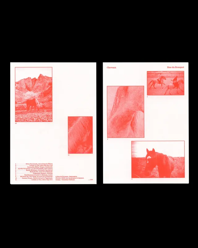
Two-page editorial spread with red-tinted photography laid out asymmetrically with typed captions and location references.

Summary
Two-page editorial spread featuring red-tinted landscape and animal photography with asymmetric layout, location headings, and numbered captions.
Visual description
Left page shows a black border frame containing a landscape scene with mountains and a donkey, followed by smaller detail shots. Right page mirrors the layout with larger animal photographs and titled sections "Chevaux" and "Rue du Bouquet" in red typography. Both pages use a consistent salmon/red color filter over photographic content, white backgrounds for copy, and a numbered reference system for locations. The asymmetric image placement creates visual flow across the spread.
Key takeaway
Color tinting as a unifying device for a multi-image editorial layout. The red monochrome treatment transforms diverse photographs into a cohesive narrative. Numbered captions paired with location headings create a guide-like structure.
Reuse notes
Strong model for travel editorial, photography books, or location-based storytelling. The red duotone technique works especially well for warm climates or vintage-feeling content. The asymmetric grid accommodates both landscape and portrait orientations. Good reference for publication design with a strong location or journey narrative.
More like this


Keep what you find
A free account saves references to boards and can send you a weekly email of picks based on what you save.
To see every result, go Pro.