Preview image. Unlock full-res
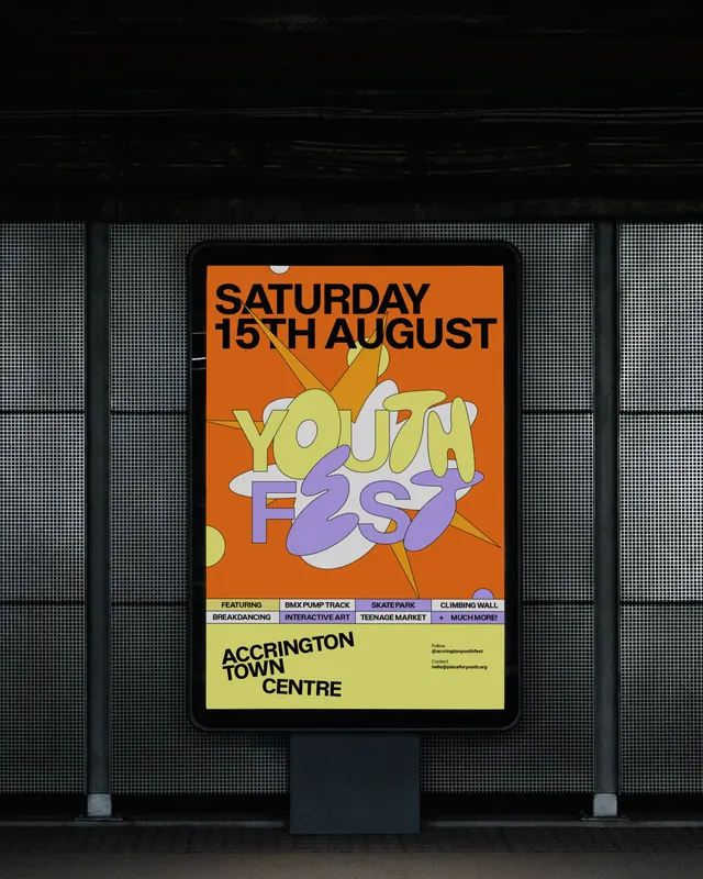
Bold, playful event identity system for a youth festival featuring vibrant orange, yellow, and purple with explosive geometric forms and chunky typography.
Summary
A vibrant event-identity system for Accrington Youth Fest combining oversized, chunky display type in yellow and purple with bold white organic shapes and radiating geometric spikes on a rich orange background. The identity flexibly scales from social tiles to large-format streetscape installations.
Visual description
Poster design (image 1) features a bright orange rectangle as the canvas. At center, chunky outlined type reads "YOUTH FEST" in yellow (top line) and purple (bottom), layered over overlapping white organic amoeba shapes with sharp angular spikes radiating outward. A small speech bubble in the upper left contains event details in solid sans-serif. The design is asymmetric but feels cohesive through the bold color palette and explosive energy.
In-situ photograph (image 2), the same poster is mounted on a storefront with a mesh metal backdrop and window framing, showing how the vibrant colors command attention at street scale. Below the poster, a lime-yellow information band lists program details and venue info.
The accompanying video (ig-dadkxa6ivc1-1.mp4) animates the geometric elements and type, adding kinetic energy to the static identity.
Key takeaway
The combination of oversized, rotund typography with spiky geometric shapes creates memorable visual contrast and movement. The warm-to-cool color blocking (orange + yellow vs. purple) reads clearly from distance. The identity system's geometric language and bold palette make it highly adaptable across formats-from digital to monumental installation.
Reuse notes
Strong reference for youth-facing, cultural, or entertainment events. The chunky typography and geometric elements work well for bold, high-energy campaigns. The playful geometric spikes could be extracted as a modular pattern for backgrounds or dividers. Best suited for high-contrast applications; the vibrant palette commands attention but needs breathing room in smaller contexts. Pair with clean sans-serif body copy to balance the playfulness of the display layer.