Preview image. Unlock full-res
A carousel of curated vintage and contemporary poster, typography, and publication layouts showcasing bold typographic hierarchy, color experimentation, and editorial composition.

Summary
A curated carousel of 7 slides spanning archival poster design, typographic treatments, and editorial composition. The collection showcases bold, oversized sans-serif posters in color variants, botanical imagery with digital text overlays, vintage collage elements, and classical publication typography across serif and script treatments.
Visual description
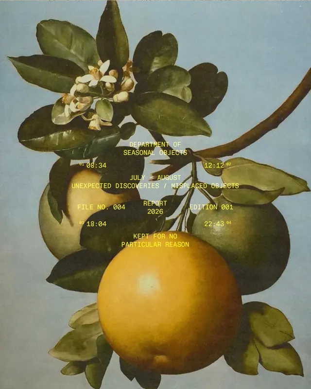
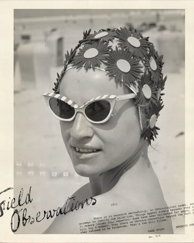
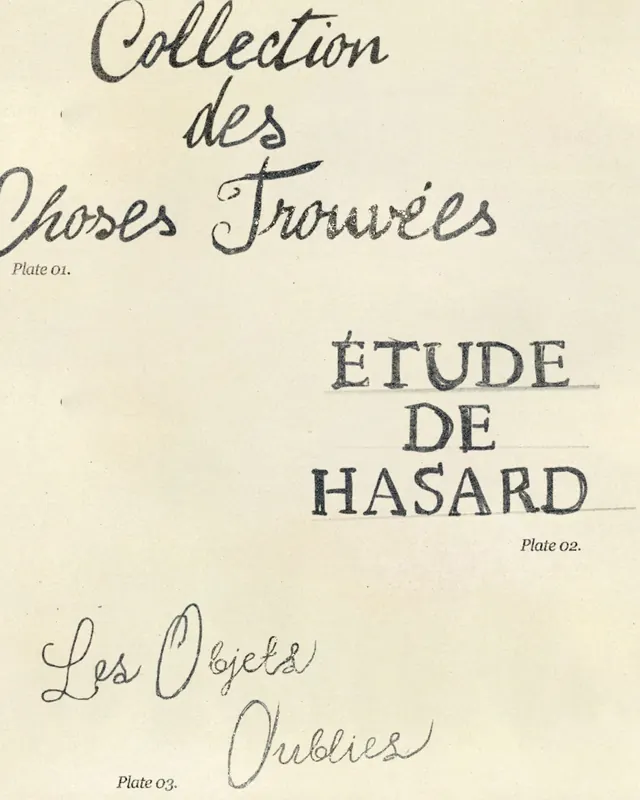
Slide 1 opens with a pink poster for "The Coast" event (July–August 1988, entry free, wind level: 6) using heavy sans-serif type in dark gray on a solid background, with dense utility text (weather conditions, water temperature). Slide 2 repeats the same composition on a warm yellow background, demonstrating color variation. Slide 3 shifts to a vintage botanical photograph of a pomelo branch with leaves and small white flowers, overlaid with yellow digital monospace type and metadata timestamps creating a "seasonal objects" scientific report format. Slide 4 is a black-and-white collage combining a 1950s–60s portrait photograph with handwritten annotations, printed case-study text, and a sculptural floral headdress accessory. Slide 5 is a publication title page in cream stock featuring three distinct typographic treatments: elegant handwritten script ("Collection des hoses Troruiés"), industrial monospace ("ÉTUDE DE HASARD"), and serif display caps ("Les Poielas Oublies"), each labeled as "Plate 01/02/03." A video component accompanies the carousel.
Key takeaway
The designer's philosophy of layering unrelated visual languages - retro event posters, natural history documentation, vintage portraiture, and classical typography - into a coherent archive. Demonstrates how consistent use of monochrome, dense type, and archival framing can unify disparate source materials into a professional visual system.
Reuse notes
Best for editorial projects, publication design, museum/archive identity systems, and retrospective or curatorial work. The color variants (pink/yellow iterations) show how a single composition scales across moods. The mix of photography, hand-annotation, and digital type overlay is effective for institutional or academic contexts. The monospace/serif combination works well for scientific or historical cataloging systems. Note: this is a stylistic collection rather than a single campaign, so individual slides may need different applications depending on context.
From this post: Synonime Studio archive of poster, typography, and publication design
View post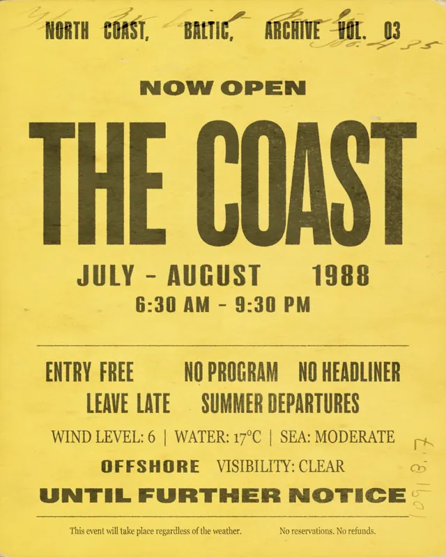
More like this
Keep what you find
A free account saves references to boards and can send you a weekly email of picks based on what you save.
To see every result, go Pro.