Preview image. Unlock full-res
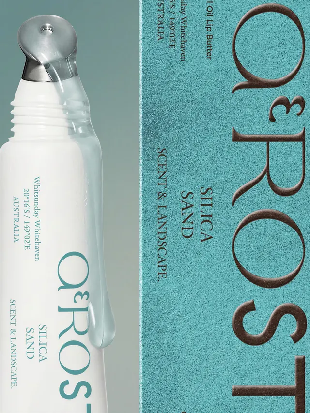
Eight-slide carousel showcasing branding, visual identity, and packaging design for ΑEROST, a luxury fragrance inspired by world terrains, featuring minimal design with geographic coordinates and a sophisticated turquoise and white palette.

Summary
A sophisticated eight-slide branding and packaging system for ΑEROST, a luxury fragrance brand inspired by world terrains, using minimal design language, a cool turquoise and white palette, and geographic coordinates as a core design element that grounds the olfactory experience in specific places.
Visual description
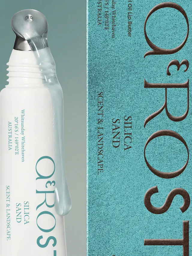
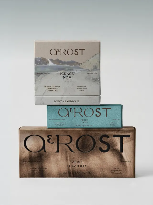
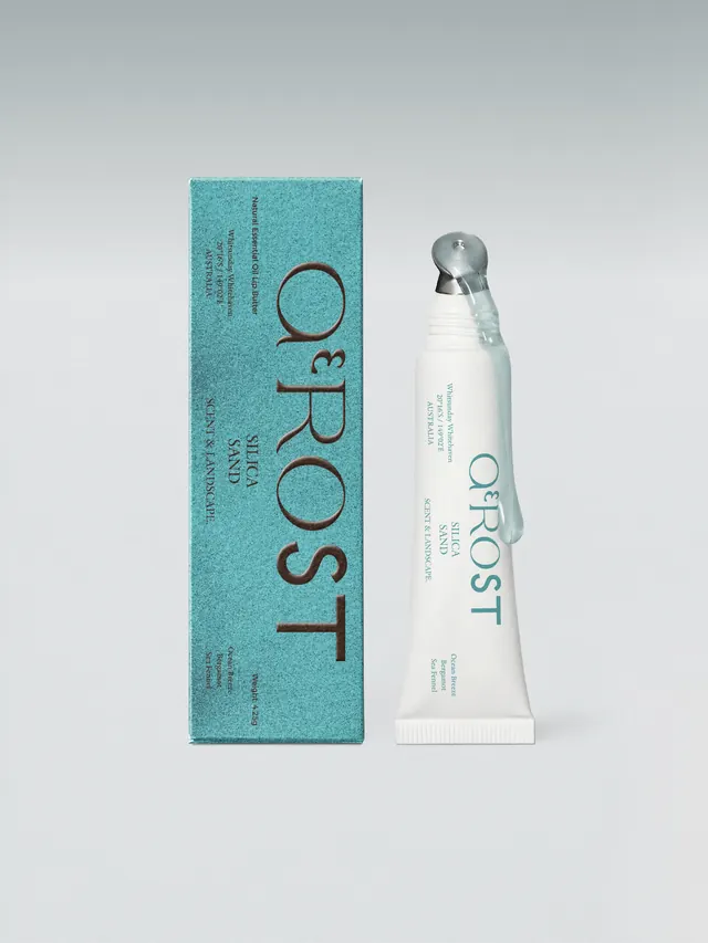
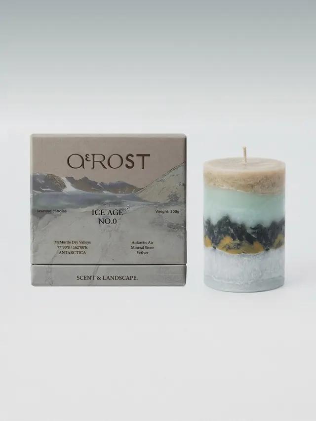
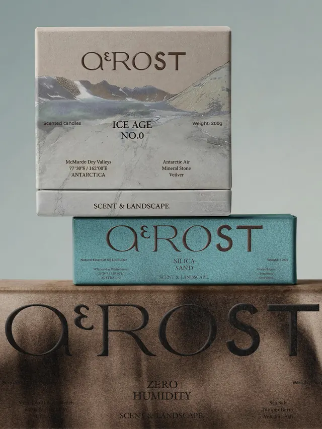
The carousel opens with a split-screen shot of a white fragrance bottle with a metallic spray head and "ΑEROST" logotype in turquoise sans-serif, alongside a turquoise textured panel with the logotype and product information arranged vertically in a minimal serif/geometric typeface. Text includes "SILICA SAND," "SCENT & LANDSCAPE," geographic coordinates (e.g., "20°16'S 149°02'E," referencing Whitsunday Australia), and terrain descriptors. Subsequent slides display the full packaging system: standalone product shots, brand mark applications, business cards or collateral with coordinates and landscape descriptions, branded accessories (possibly matchbooks or boxes), product photography emphasizing the minimalist bottle form and label typography, additional location-specific coordinate labeling (including Antarctic references like "77°30'S 162°00'E" and "McMurdo Dry Valleys"), and packaging mockups showing how the design extends across product tiers and variants.
Key takeaway
Embedding geographic specificity (coordinates and terrain names) as a brand differentiator for fragrance, turning abstract olfactory memory into locatable, rational design language. The restraint of the turquoise and white palette, combined with minimal sans-serif and serif typography, conveys luxury without decoration. The split packaging format (bottle + informational panel) creates visual intrigue while maintaining functional minimalism.
Reuse notes
Excellent reference for luxury goods and fragrance branding that seeks sophistication without ornament. The coordinate integration is particularly valuable for place-based or experiential brands. Works well for packaging that needs to communicate product complexity (scent composition, terrain inspiration) through restraint and clever information hierarchy. The two-material approach (bottle form plus textured collateral) is reusable for brands seeking tactile differentiation in a crowded category. Best for premium positioning that values craftsmanship, geography, and conceptual depth.