Preview image. Unlock full-res
A visual narrative design system for John Connor using bold pixelated typography and experimental layouts on dark backgrounds, combining retro digital aesthetics with contemporary editorial storytelling.

Summary
A bold animated carousel project for John Connor using pixelated, bright red typography against black voids, framing a narrative about ideas, human stories, and creative intention. The design system combines retro digital aesthetics with storytelling depth.
Visual description
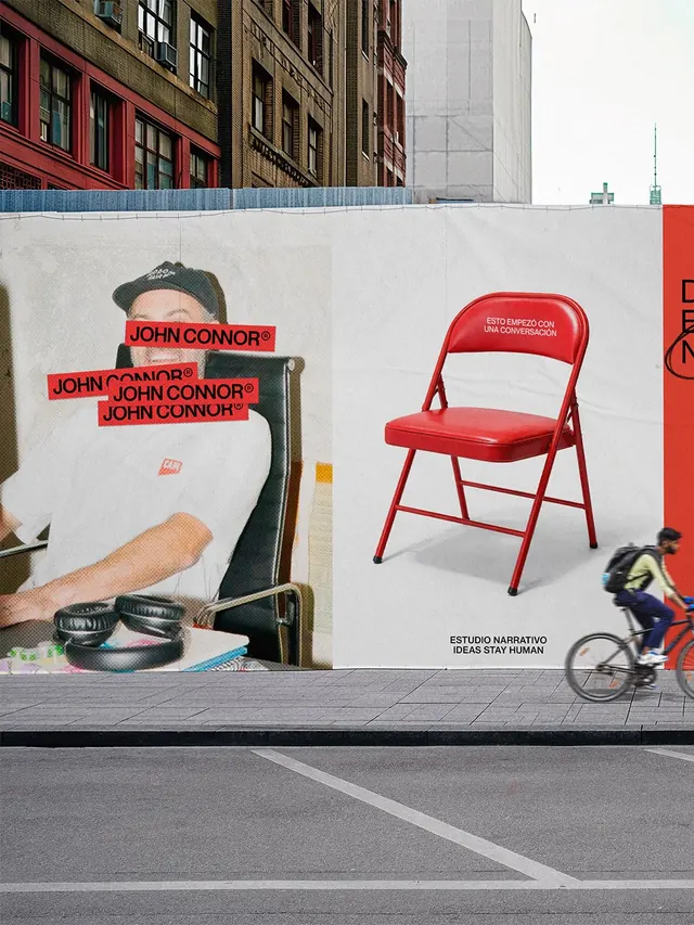
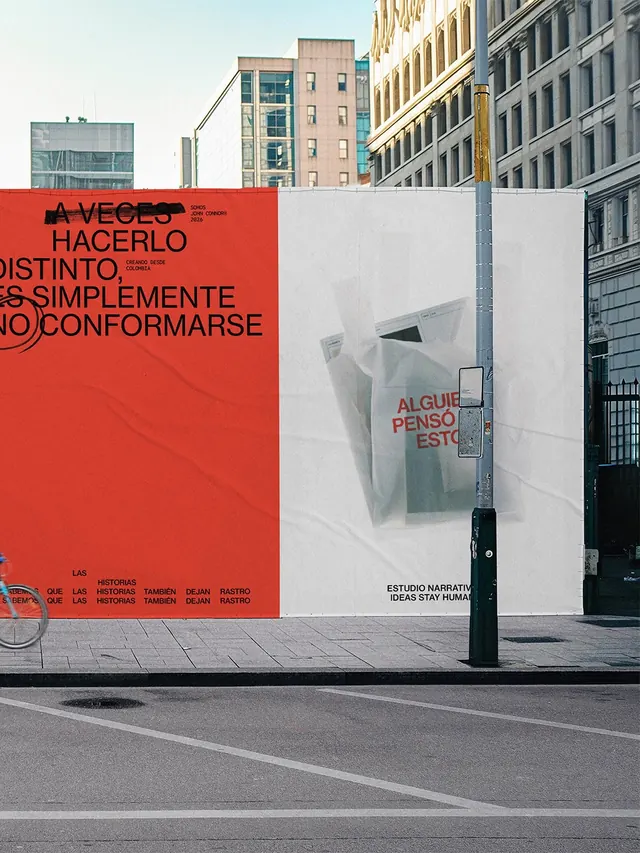
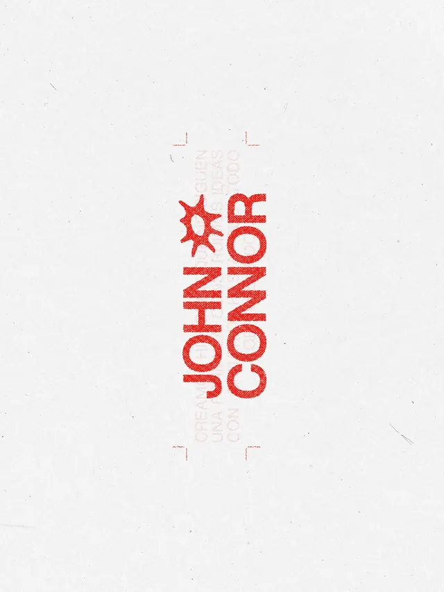
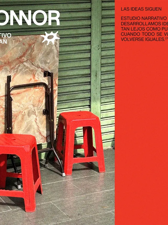
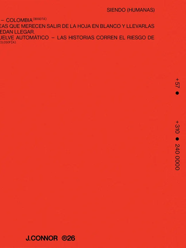
The carousel opens with the client name in large pixelated red monospace type centered on black, followed by subsequent slides that layer narrative text in Spanish. The typography treatment deliberately evokes early digital systems and LED signage, creating high-contrast compositions. Each slide introduces blocks of text, some legible and others intentionally distressed or fragmented as part of the visual storytelling. The layout alternates between centered and asymmetric text arrangements, maintaining the bold red-on-black color scheme throughout. Later slides introduce photography and editorial spreads, showing the system applied to printed matter. The aesthetic walks a line between brutalist restraint and playful experimentation, with text sometimes pixelated, sometimes bleeding off edges or layered with imagery.
Key takeaway
The project demonstrates how retro digital typography (pixelated monospace) can feel fresh and emotionally resonant when deployed with clear narrative intent and deliberate typographic hierarchy. The constraint of black and red (plus white for accents) focuses the design without feeling limiting. Stories drive the visual system, not the reverse.
Reuse notes
Strong reference for editorial and cultural design projects, particularly those targeting creative audiences. The red-and-black palette is striking and memorable but polarizing; reserve for contexts where boldness aligns with brand voice. The pixelated typography reads well in video and at large sizes but becomes difficult at small sizes. Best suited for motion-based delivery (Instagram carousel, animated sequences) rather than static print. Pairs well with Spanish-language or bilingual narrative content; the wordiness of the layouts benefits from meaningful copy.