Preview image. Unlock full-res
A video mapping festival's fundraising campaign that transforms detailed expense lists and cost breakdowns into visual art, using distressed typography and subversive design to ask for donations.

Summary
A Montreal video mapping festival's campaign for their scaled-back 2025 edition turns budgetary transparency into compelling visual design. Rows of itemized costs, distressed typography mimicking cheap printing, and supermarket coupon references create a fundraiser that feels honest rather than ask-heavy.
Visual description
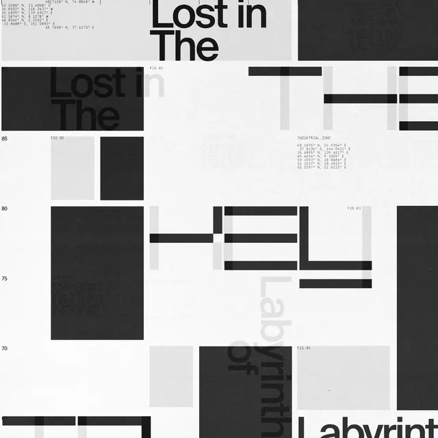
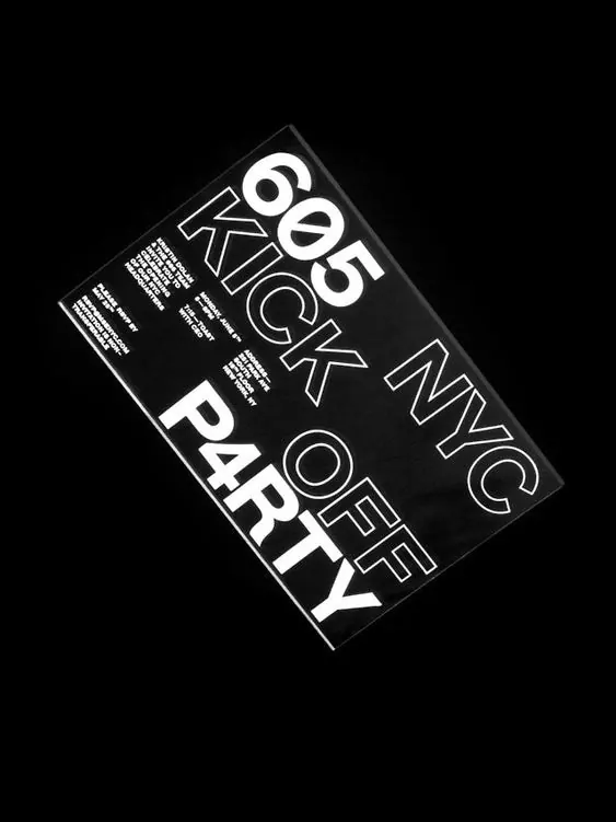
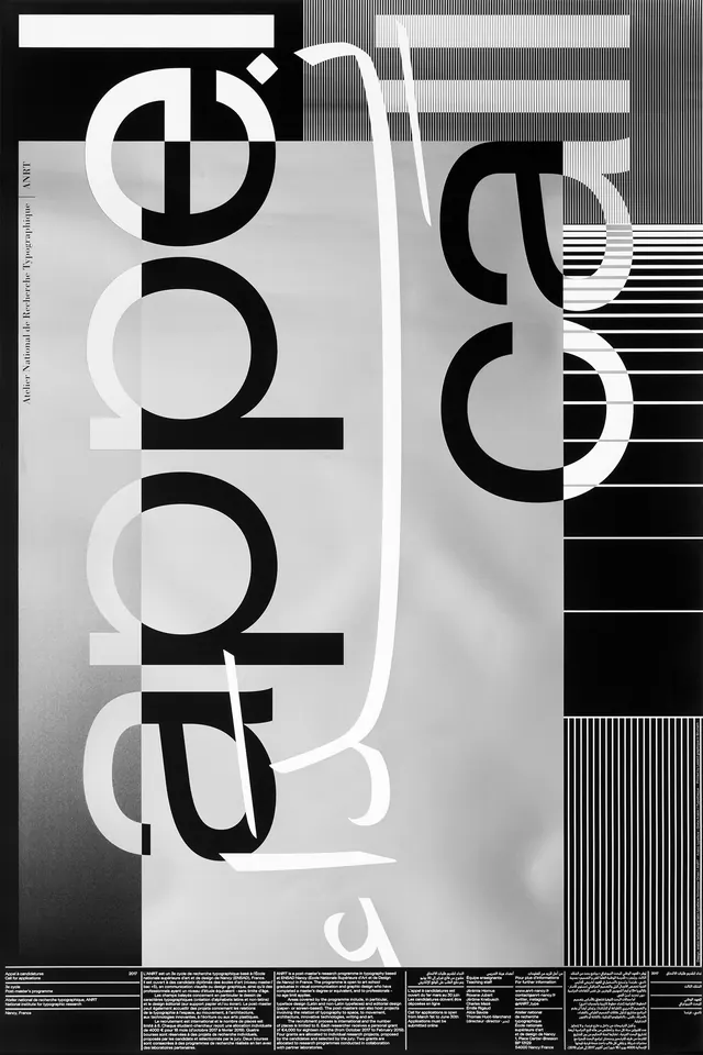
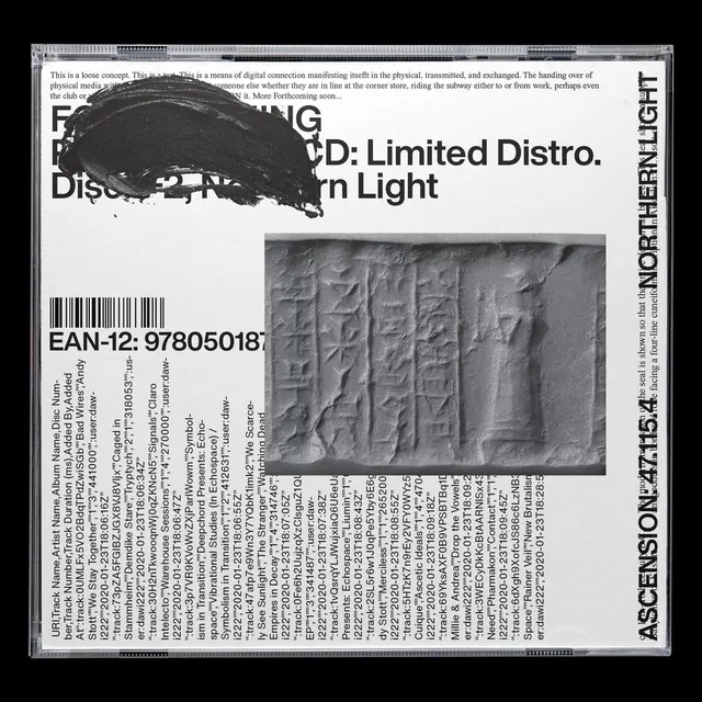
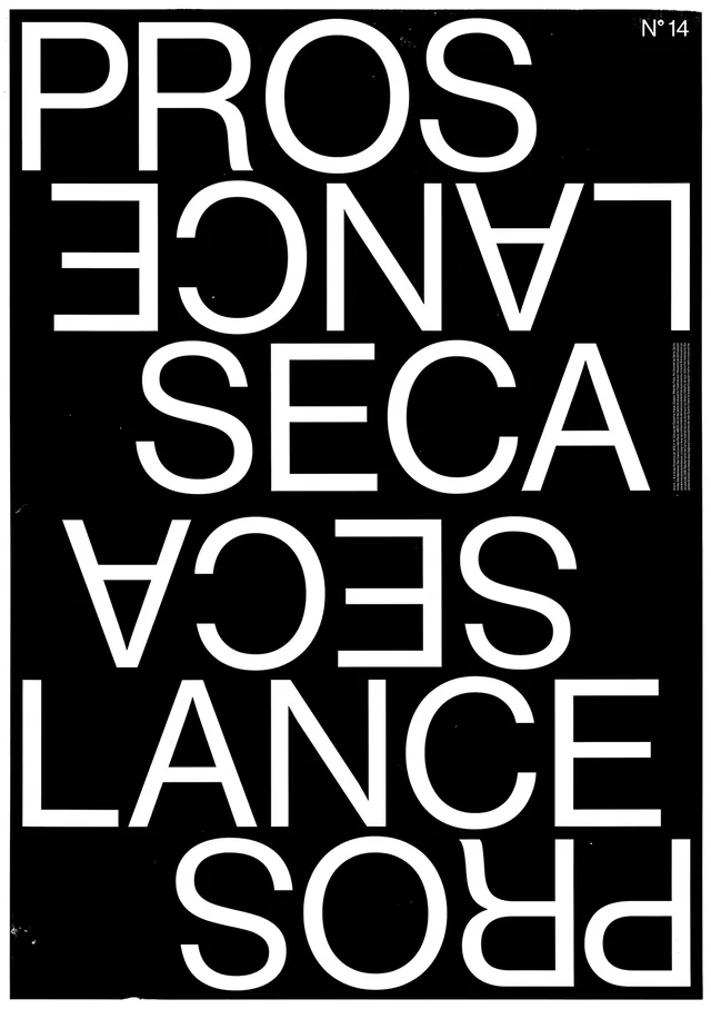
The carousel showcases animated sequences of the campaign material. Tables of expenses (line items for equipment, venues, production costs) fill laptop and print screens in stark black and white. The typography treatment deliberately mimics the degradation and compression of cheap xerox or budget printing, with distressed character edges and imperfect registration. Supermarket coupon visual language appears alongside financial data. Overlaid text in OT Alpha sans-serif announces editions and dates, sometimes running perpendicular to the expense table or floating freely across the layout. Motion design adds animated reveals and transitions that draw attention to specific cost categories. The final reveal hints at an interactive element: a hidden Pong game unlocks when viewers donate.
Key takeaway
The campaign inverts typical fundraiser messaging by leading with honesty about what things actually cost, making the ask feel principled rather than desperate. Distressed typography enhances the authenticity. The hidden game element transforms donation into a small ritual of discovery, not obligation.
Reuse notes
Excellent reference for nonprofit and cultural institution fundraising campaigns, particularly those targeting design-literate audiences. The black-and-white palette feels urgent without feeling grim. The data-as-hero approach works best when actual numbers are compelling; don't force this treatment onto campaigns with inflated or vague budget claims. The distressed typography trend can feel dated quickly; use with caution if longevity matters. Best suited to motion and digital contexts; the degraded type is harder to read in static print.