Preview image. Unlock full-res
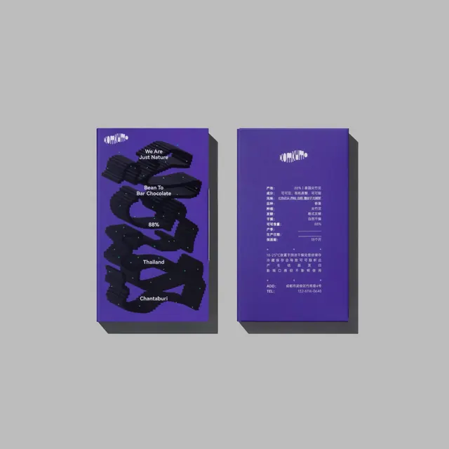
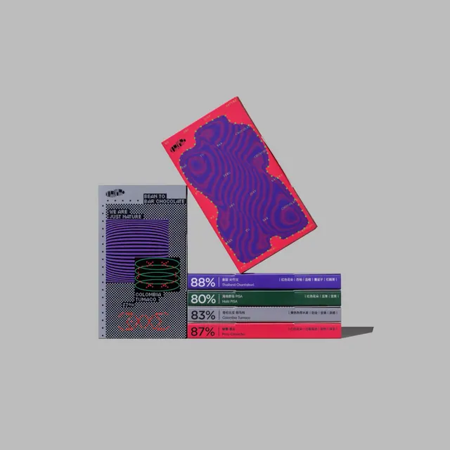
Premium chocolate packaging system blending traditional craft with contemporary digital aesthetics, featuring hypnotic digital wave patterns, regional origin data visualization, and vibrant purple-pink color palette.

Summary
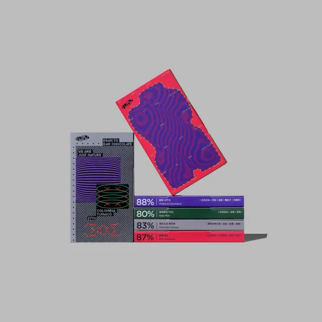
A premium chocolate bar packaging system that marries traditional sourcing transparency with cutting-edge digital design: hypnotic purple-pink wave patterns cover the front, while a modular data visualization system on the back displays cacao origin percentages through color-coded bars and percentage callouts.
Visual description
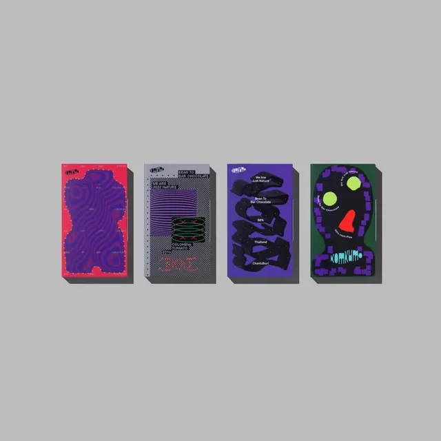
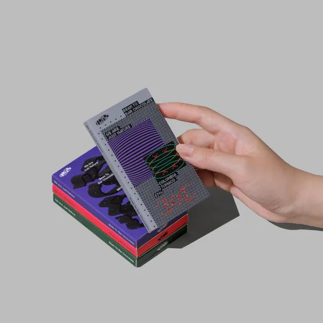
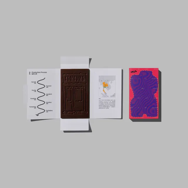
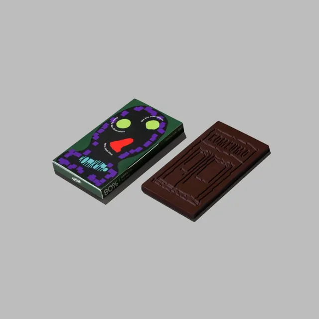
Frame one displays a flat photograph of two chocolate boxes angled against a neutral gray background. The primary design box features a vivid purple-pink gradient background with intricate flowing wave patterns rendered in contrasting dark purple, creating a mesmerizing hypnotic effect. A monospace label displays cacao origin information (e.g., "88% THAILAND Chiang Saen Chanthaburi"). The secondary box shows the full system with multiple color-blocked origin bars stacked vertically, each labeled with percentage, region, and metadata in clean sans-serif type. Subsequent frames reveal different color variations-from the primary hot pink to deeper magentas-and showcase the packaging from different angles, the box structure, and detailed shots of the data visualization bars and typography.
Key takeaway
The integration of consumer transparency (origin percentages) as a primary design element rather than hidden fine print. The visual strategy of using color-coded bars for different origins creates both aesthetics and information hierarchy. The hypnotic wave pattern as a metaphor for the sensory experience of chocolate melting on the tongue. The balance between organic wave motifs and rigid data visualization creates visual tension that feels premium and intentional.
Reuse notes
Excellent reference for food/beverage brands embracing supply chain transparency as a design feature. The wave pattern is hypnotic and memorable; could be adapted to other product categories. The color palette-hot pinks and deep purples-reads as contemporary and upscale. The data visualization bars are infinitely scalable depending on sourcing complexity. Works best for premium chocolate, tea, or coffee brands where origin matters to pricing and perception. The gradient and wave can be digital or print; the effect translates well to both. The monospace typography grounds the visual complexity and suggests technical rigor. Not suitable for minimalist or subtle brand approaches-this demands boldness and visual presence.