Preview image. Unlock full-res
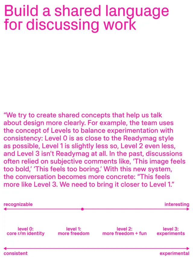
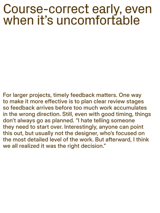
A ten-slide carousel article on effective design feedback practices by Alexander Moskovskiy, Readymag's head of design, mixing typography, quotes, and instructional graphics.

Summary
A ten-slide educational carousel from Readymag sharing design feedback best practices. Features bold magenta typography on light backgrounds, portrait photography, and instructional graphics that outline five key principles for effective feedback within design teams.
Visual description
Slide 1: Cover slide with bold magenta sans-serif headline "5 NOTES ON GIVING DESIGN FEEDBACK" on a warm brown background. Slides 2-9: A mix of typographic slides with white backgrounds and magenta text, portrait photography of Alexander Moskovskiy in a magenta-tinted circular crop, and instructional graphics. Key quotes are set large and direct. Some slides use all-caps display type for emphasis. Slide 10 is a call-to-action directing readers to the full article on Readymag's blog. High contrast and clean spacing throughout.
Key takeaway
The confident use of a single bold accent color (magenta) paired with clean typography to structure educational content. The portrait photography humanizes the advice. Breaking complex ideas into distinct, visually separated slides with a consistent typographic hierarchy makes the content scannable and memorable.
Reuse notes
Strong model for educational carousels on design practices and team culture. Works well for B2B SaaS or agency content. The magenta-on-white palette is distinctive but could be adapted to brand colors. Good reference for vertical, portrait-oriented carousel layouts.
From this post: Readymag design feedback article carousel
View post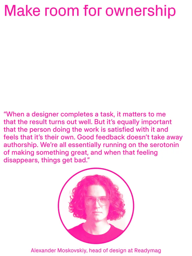



More like this






Keep what you find
A free account saves references to boards and can send you a weekly email of picks based on what you save.
To see every result, go Pro.