Preview image. Unlock full-res
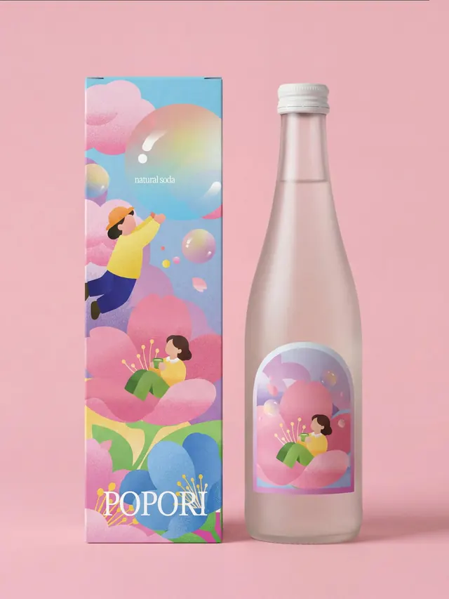
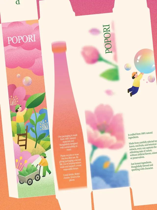
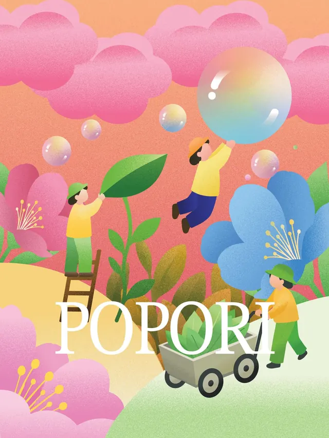
Illustrated packaging design for Popori natural soda showing multiple beverage box formats with charming characters, botanical elements, and soft gradient colors.
Summary
A comprehensive packaging redesign for Popori natural soda showing multiple carton variants unified by whimsical illustration, pastel gradients, and hand-drawn characters among plants and clouds. Each variant maintains brand consistency while exploring different color palettes and compositions.
Visual description
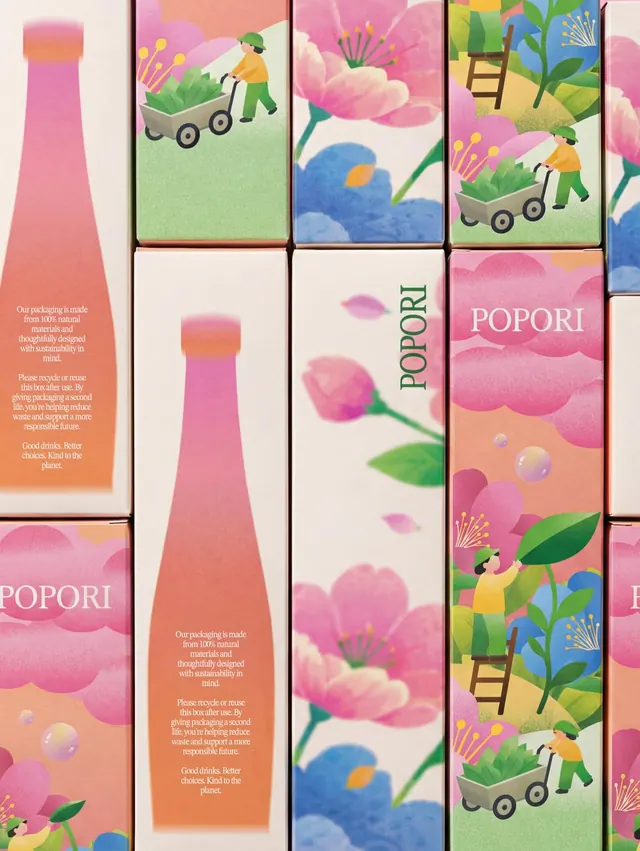
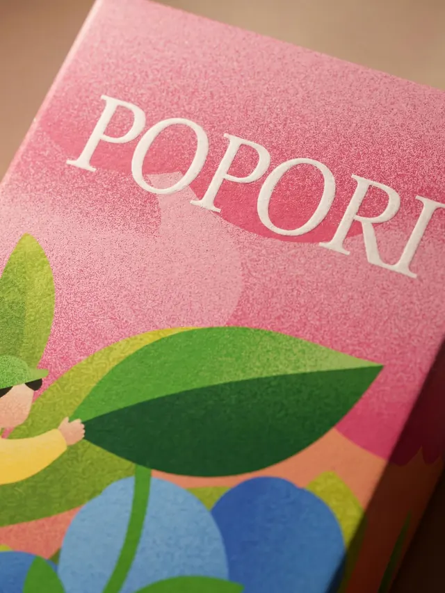
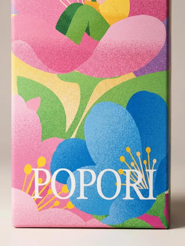
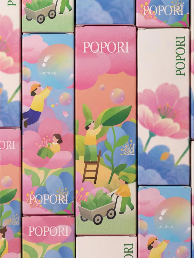
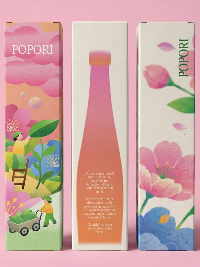
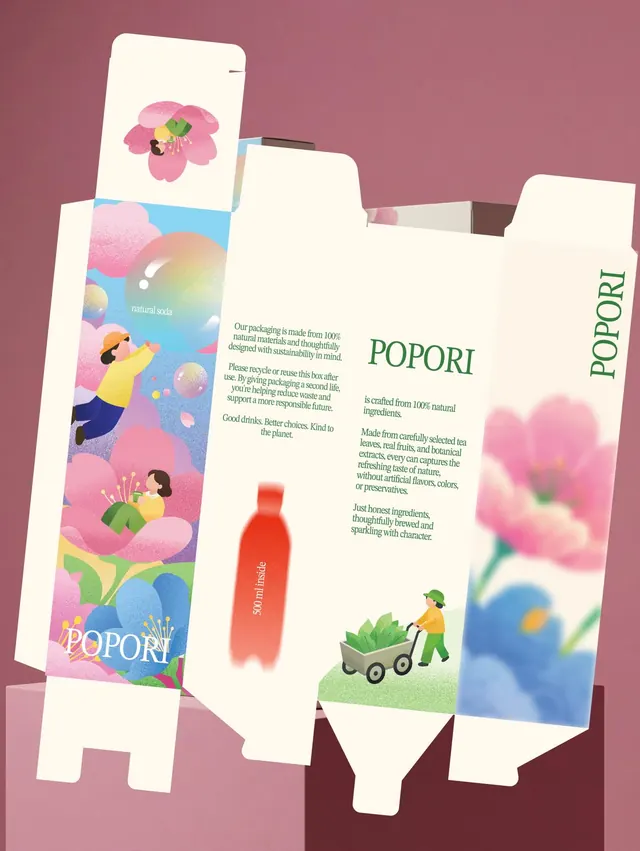
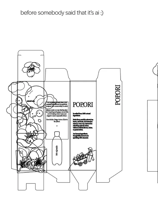
Three main carton formats dominate the lead slide: a pink gradient box with illustrated figures gardening among oversized leaves and flowers (left), a cream box with soft-focus pink bloom photography (center), and a blue gradient box with figures interacting with organic shapes and bubbles (right). Subsequent slides reveal packaging structure, product photography, illustrated product shots, and detailed graphics showing typography and brand patterns. The illustration style is soft, organic, and rounded with characteristic grain texture overlay. Color gradients flow from warm pinks and corals through yellows to cool blues and greens. Small human figures and botanical elements create a playful, approachable feeling. Tagline "natural soda" appears in clean sans-serif typography.
Key takeaway
The dual-strategy approach here is powerful: pairing delicate illustrations with clean product photography creates both emotional warmth and brand credibility. The grain texture treatment (Adobe Illustrator effect) adds handmade tactility to digital work. The consistent color system and character style make the brand memorable across multiple SKUs.
Reuse notes
Excellent reference for eco-friendly, natural, or lifestyle food brands targeting young, design-conscious consumers. The illustrated-character-in-botanical-setting formula is broadly reusable. The grain texture overlay is a quick technique to add warmth to flat vector art. Works for: beverages, snacks, wellness products, organic goods. Pair with clean product photography for credibility. The playful characters prevent the soft pastels from feeling saccharine. Scale: strong enough for shelf presence, detailed enough for social media close-ups.
From this post: Popori natural soda packaging system
View post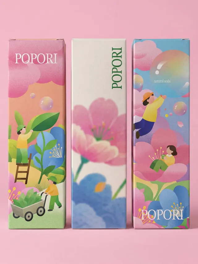
More like this


Keep what you find
A free account saves references to boards and can send you a weekly email of picks based on what you save.
To see every result, go Pro.