Preview image. Unlock full-res
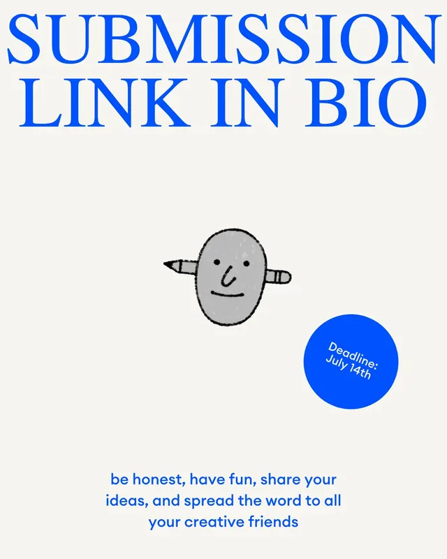
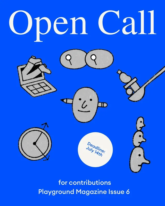
A five-slide open call poster series for an independent creative magazine, balancing bright blue backgrounds with playful illustrated elements and clear call-to-action messaging.
Summary
A cohesive five-slide carousel announcing Playground Magazine's Issue 6 open call. Each slide uses a bright cobalt-blue background with playful hand-drawn iconography (clock, art tools, speech bubbles, people) and white sans-serif typography to invite essays, illustrations, photo essays, and interviews.
Visual description
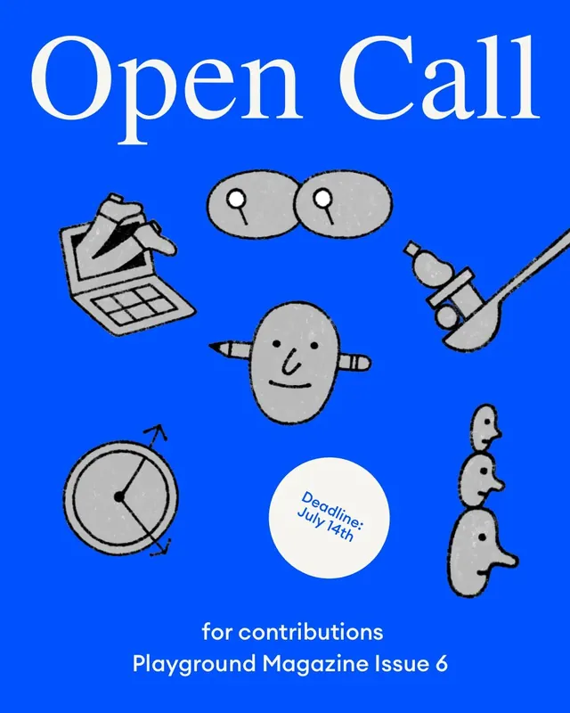
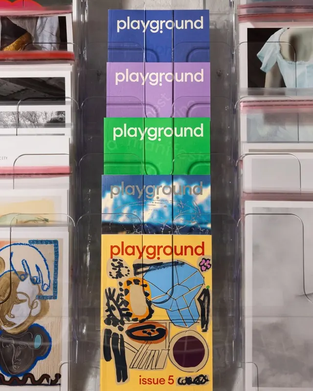
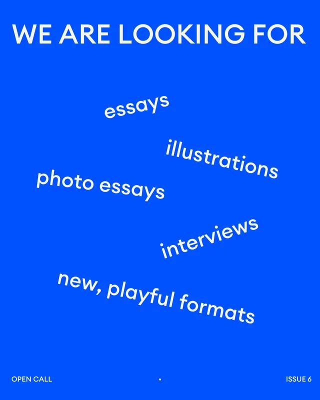
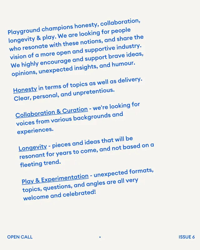
Slide 1: "Open Call" headline in large serif type centered on bright blue, surrounded by cheerful illustrated icons-a clipboard with checklist, two speech bubbles with question marks, a clock face, a brush, and stylized profile shapes. A white circle in the center states "Deadline: July 14th". Slide 2: A lifestyle photograph of magazine issues stacked in a window display with colored-band variations (blue, pink, green, photographic, yellow backgrounds, each repeating "playground"). Slide 3: "WE ARE LOOKING FOR" in all-caps white sans-serif, with words scattered across the blue space in varied sizing and angles: "essays", "illustrations", "photo essays", "interviews", and "new, playful formats". Slide 4: Body-copy text in blue italic serif explaining Playground's values (honesty, collaboration, longevity, play) and submission guidelines. Slide 5: "SUBMISSION LINK IN BIO" as the final call-to-action, with the deadline reaffirmed and a message: "be honest, have fun, share your ideas, and spread the word to all your creative friends".
Key takeaway
The consistent bright-blue background anchors brand recognition across five distinct layouts, while hand-drawn illustrations add personality and approachability. Mixing sans-serif headlines with serif body copy creates hierarchy without formality. The scattered-text approach on Slide 3 feels experimental and inviting-aligned with the magazine's creative mission.
Reuse notes
Excellent template for creative open-calls and publication announcements. The playful illustration style pairs well with editorial and cultural organizations that want to project inclusivity without losing professionalism. Works on Instagram carousels to build suspense. The color treatment (solid background + white type + illustrated accents) is flexible-easily adaptable to other brand colors. Best for audiences already familiar with creative/design culture.