Preview image. Unlock full-res
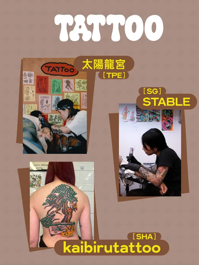
Vibrant carousel poster for a multi-brand market event celebrating a decade in Singapore, combining playful illustration, bold typography, and segmented color blocks.

Summary
A multi-slide carousel advertising Common Rare's 10th-anniversary market expansion to Singapore, mixing segmented geometric blocks, hand-drawn illustration, cheeky mascot characters, and dense information hierarchies all held together by a hot-pink background.
Visual description
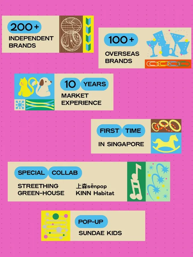
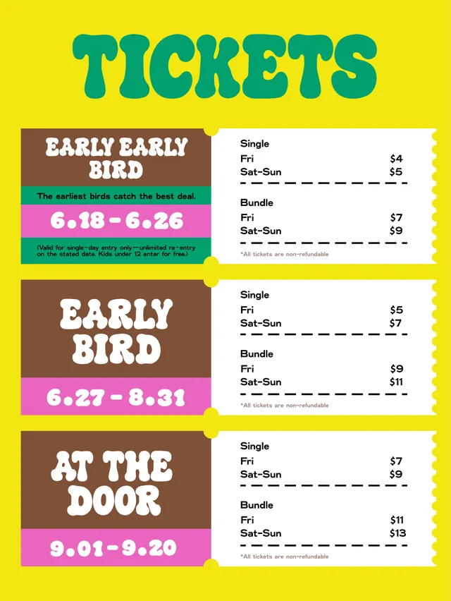
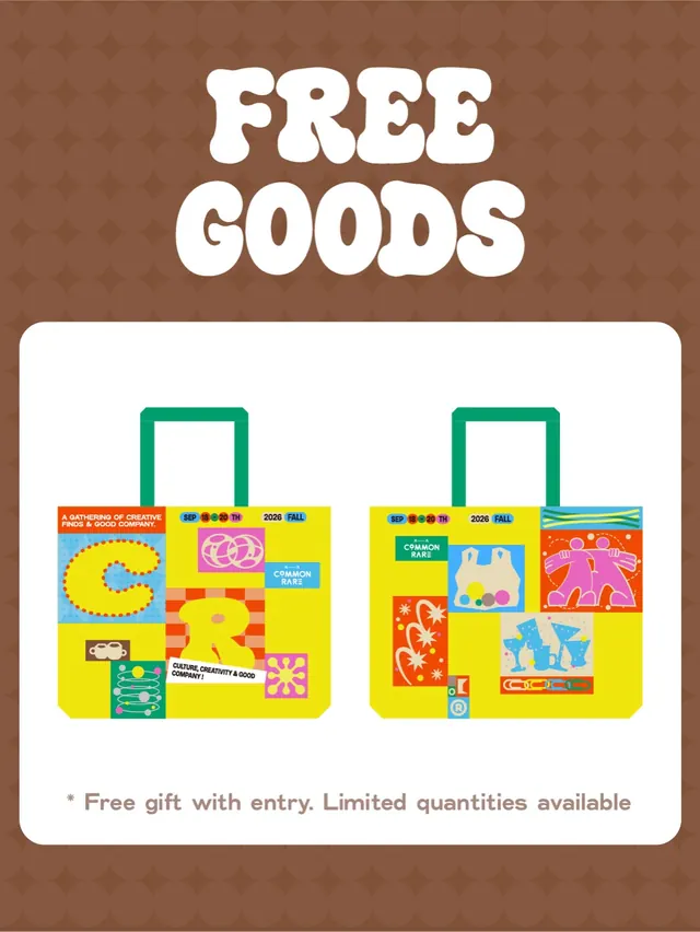
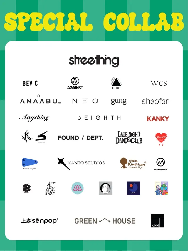
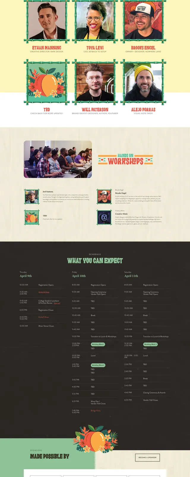
Slide 1 opens with a grid of colored blocks (yellow, pink, blue, brown, green, beige) containing playful motifs: logos, oversized numbered badges ("SEP 18-20"), hand-drawn shapes, illustrated people, typography, and decorative elements. Slides 2–3 zoom into the event fundamentals (200+ brands, 10 years experience) using rounded caps and simple shapes on that pink field. Slide 3 is a yellow-background pricing table with chunky brown and pink bars for hierarchy. Remaining slides showcase free gifts, special collaborations, and tattoo artists via the same playful, blocky aesthetic. Throughout: hand-drawn line art, sans-serif type at multiple scales, and warm, highly saturated color runs.
Key takeaway
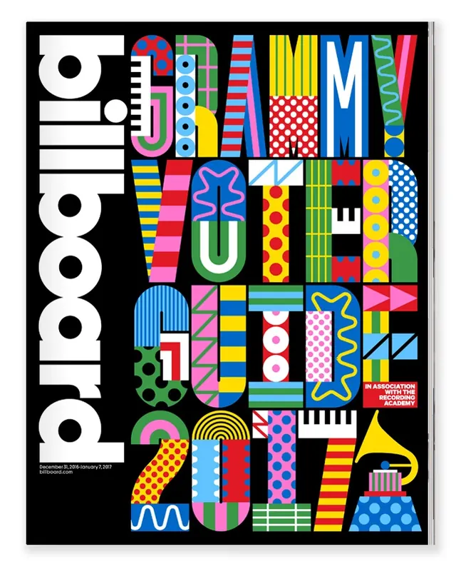
The aggressive use of segmented blocks and a single dominant pink as visual glue-each element is isolated but the pink field binds them. Oversized numbers and chunky sans-serif type used as graphic devices, not just labels. Illustration + photography + typography live at equal weight, no hierarchy by medium.
Reuse notes
Best for young, culturally engaged audiences and celebration-of-community events. The denseness works when the information is truly necessary (dates, price tiers, artist names) rather than marketing fluff. Pair with hand-drawn secondary elements for warmth. Works especially well for markets, festivals, and pop-ups where the heterogeneity of vendors IS the point.