Preview image. Unlock full-res
A twelve-slide carousel documenting the logo design and typographic exploration for Nike Air Max Day 2026, showing iterative mark development and hand-drawn sketches.

Summary
A process documentation carousel showing the logo and typography work for Nike Air Max Day 2026, spanning from early sketch explorations and mark variations to refined versions ready for application.
Visual description
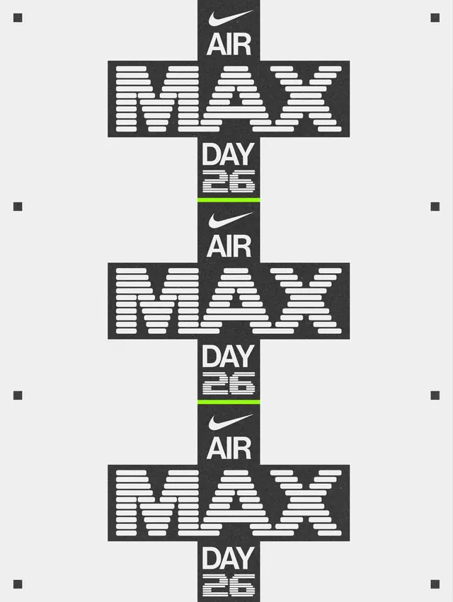
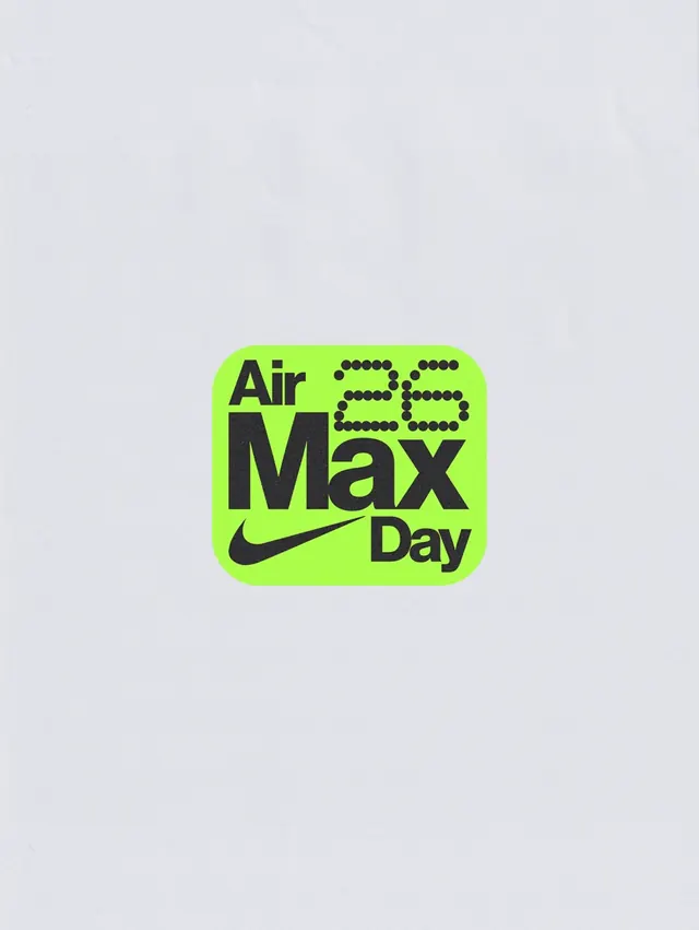
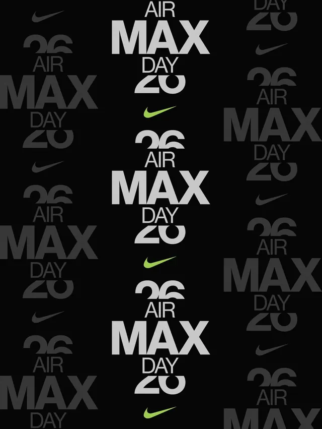
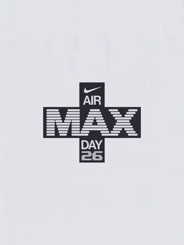
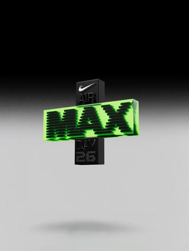
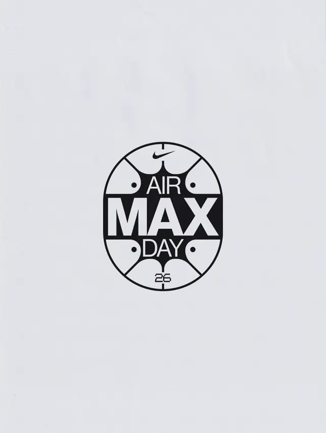
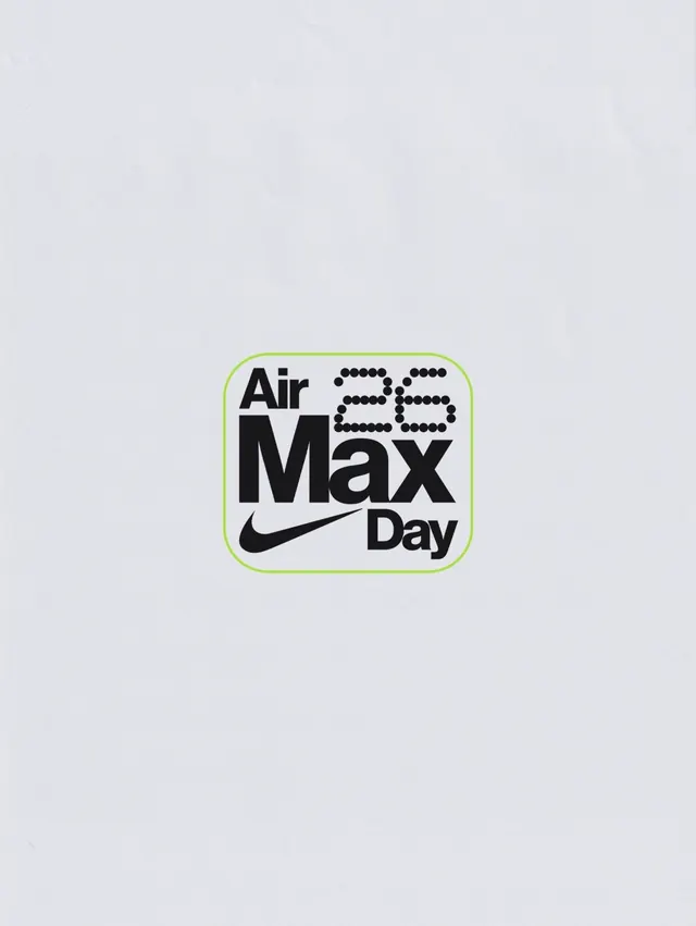
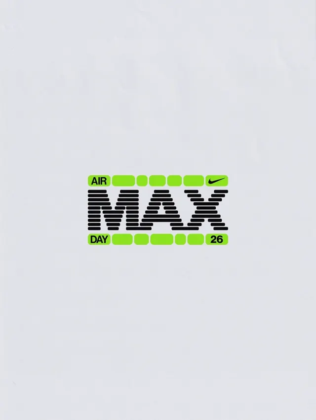
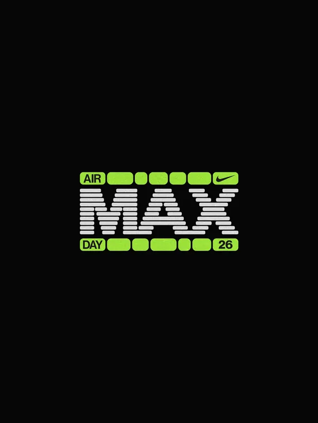
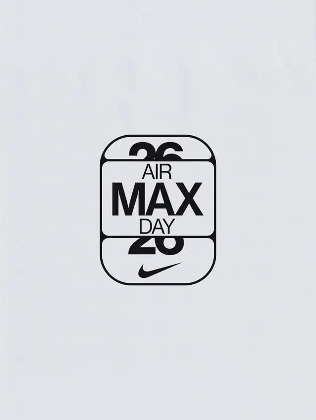
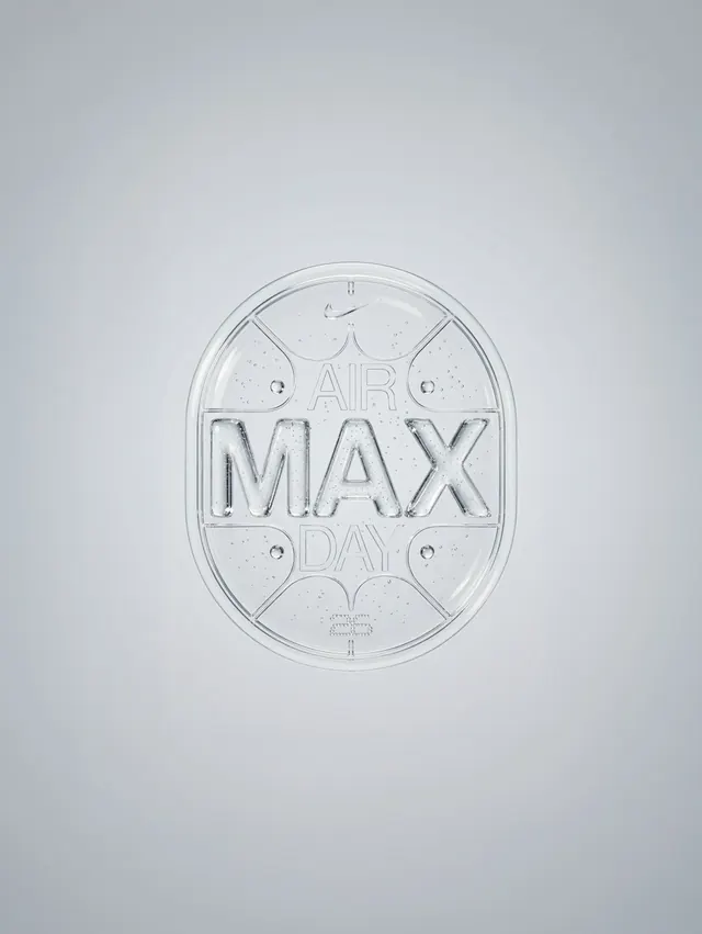
Slide 1 shows a primary logo mark: a pill-shaped seal with "AIR MAX DAY" inside modular lines, embossed or printed on a light ground. Subsequent slides reveal hand-drawn and digital iterations of the same mark at various angles and scales, type treatments exploring glitch/scan-line effects in the MAX letters, and poster concepts stacking the logo vertically with the Nike Swoosh. The palette stays strictly monochrome and near-monochrome, with occasional lime-green accents. Type experiments use horizontal line-fills and fragmentation to suggest motion or digital degradation. Overall: methodical documentation of mark refinement over approximately 12 steps.
Key takeaway
The scan-line/glitch effect on the MAX wordmark as a modernist gesture-it references digital culture without overstyling. The pill-shaped seal with modular interior lines gives the mark instant recognizability and scalability. Breaking the type into horizontal segments creates a visual rhythm that reads as both energetic and precise.
Reuse notes
Excellent reference for sports brand identity and motion-inspired typography in static context. The glitch treatment is strongest when used sparingly (as an accent) rather than across all type. Works well for athletic or tech-forward brands celebrating milestones. The systematic presentation of sketches and refinements is a model for showing design rigor to stakeholders.