Preview image. Unlock full-res
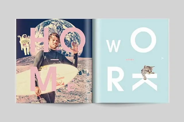
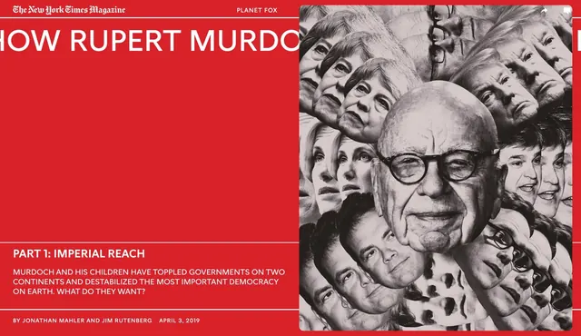
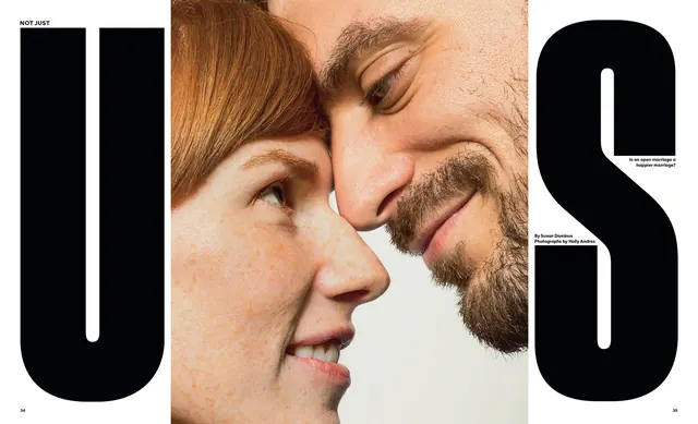
Two-page editorial spread featuring large-scale typography and a collaged portrait with pastel overlays, demonstrating bold layout hierarchy.
Summary
A two-page magazine spread with oversized blocky typography ("PRO" on the left, "WORK" on the right, split across the gutter) layered over a collaged portrait image with pastel color washes.
Visual description
Left page: A collaged astronaut/portrait image with pink and beige tones overlaid, beneath oversized letters spelling "PRO". Right page: A solid light cyan background with large white letters reading "WORK" and a small image of a cat integrated below. The typography is sans-serif, blocky, and intentionally heavy. The overall composition is asymmetric, with the left page dense and the right deliberately sparse. A horizontal line separates the pages at the gutter.
Key takeaway
The contrast between a dense, image-heavy left page and an airy, type-dominant right page creates visual rhythm and keeps the spread from feeling monotonous, while the oversized letters establish immediate hierarchy.
Reuse notes
Perfect reference for editorial design that needs to balance imagery with bold typography, especially in contemporary magazines, portfolios, or lookbooks. The split approach works well when you want to showcase both mood (through imagery) and concept (through text) without competition. The pastel overlays are a trend-forward way to unify disparate image materials.
More like this

Keep what you find
A free account saves references to boards and can send you a weekly email of picks based on what you save.
To see every result, go Pro.