Preview image. Unlock full-res
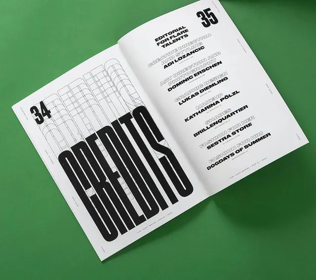
A two-page magazine layout featuring large-scale typographic credits and structured information.
Summary
A two-page magazine layout featuring large-scale typographic credits and structured information.
Visual description
The layout uses a high-contrast black-on-white scheme with an oversized, condensed 'CREDITS' wordmark spanning both pages. The right page features a structured list of names and roles in a clean, sans-serif font, while the left page incorporates subtle architectural line-art patterns behind the large text.
Key takeaway
Use extreme scale contrast between oversized display type and small, structured body text to create a clear visual hierarchy.
Reuse notes
Apply this when designing high-end magazine spreads, lookbooks, or portfolio credits where typography is the primary visual element.
More like this
Keep what you find
A free account saves references to boards and can send you a weekly email of picks based on what you save.
To see every result, go Pro.