Preview image. Unlock full-res
Design or architecture editorial layout with warm earth tones, serif typography, and refined image-text balance.
Summary
A warm editorial layout for a design publication using earthy brown and taupe palette, likely for an article on architecture or interior design, with proportional text and image hierarchy.
Visual description
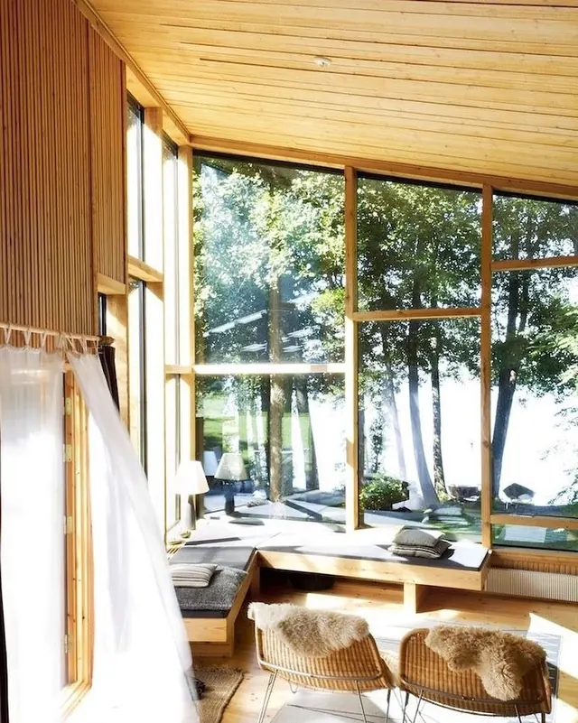
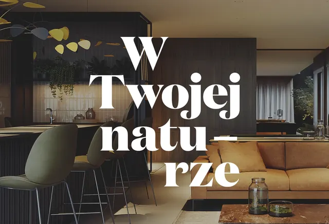
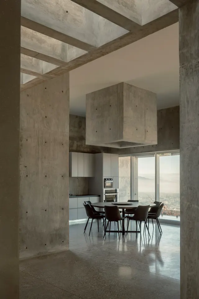
Warm taupe, brown, and clay tones create the color story. An image (possibly architectural photography or design documentation) occupies a primary portion of the layout. Supporting text—likely a headline and body copy—sits alongside or beneath the image. Typography appears to use a serif font for headlines and a clean sans-serif for body text. The layout is organized with clear alignment and breathing room. No bright accent colors; the muted palette creates a cohesive, editorial mood. The overall effect feels like a premium design blog or magazine spread.
Key takeaway
Warm, cohesive editorial voice. Using a restricted, harmonious color palette (all warm, all muted) across both typography and supporting elements creates a magazine-like sophistication. The palette signals taste and care.
Reuse notes
Excellent reference for editorial design in the architecture and interior design space. The warm earth tones are on-brand for the creative industries. Study how the image integration supports (rather than overwhelms) the typography. Good for blog designs targeting design-conscious audiences. The serif/sans pairing is classic and readable at length. The muted palette also tests your ability to create contrast through scale and weight rather than color—valuable skill for magazine design.