Preview image. Unlock full-res
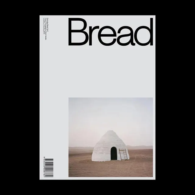
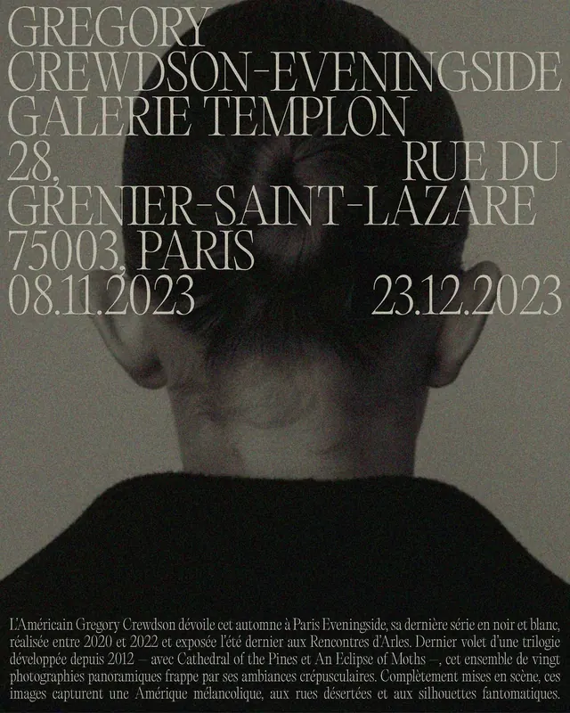
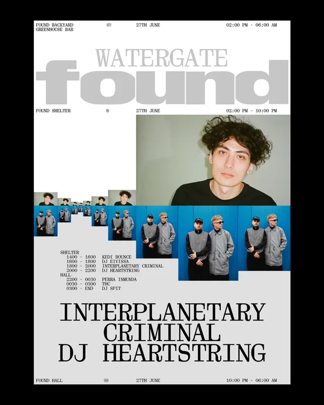
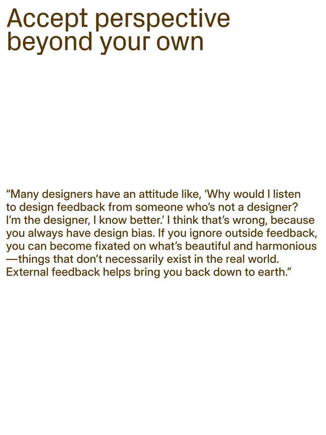
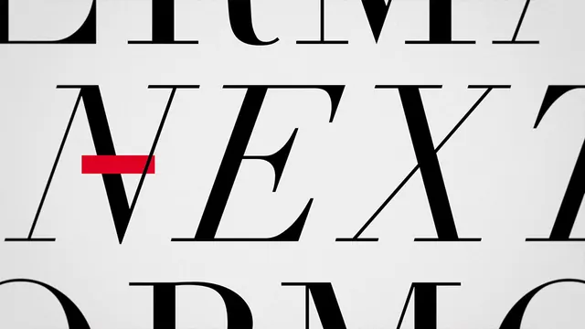
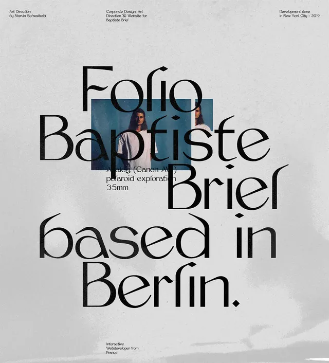
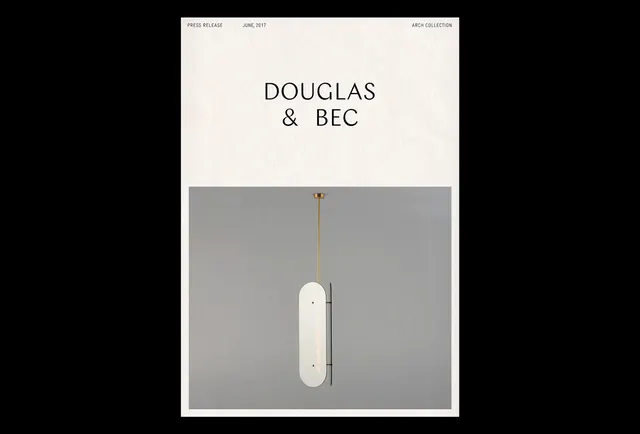
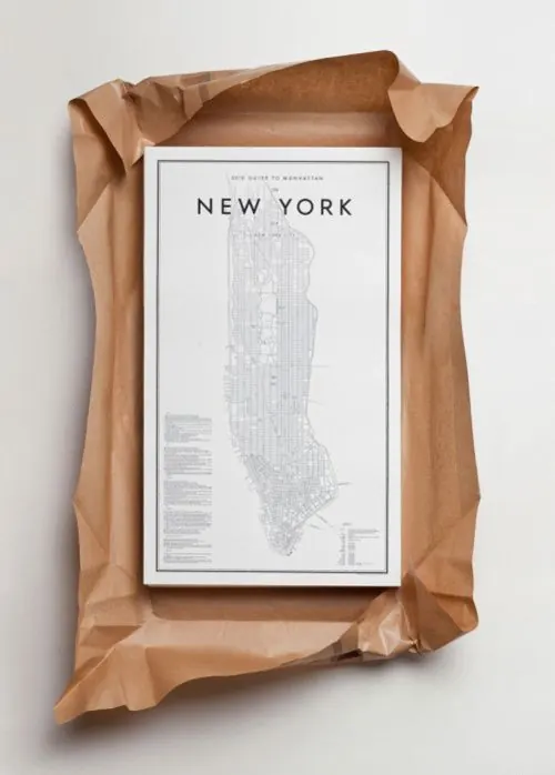
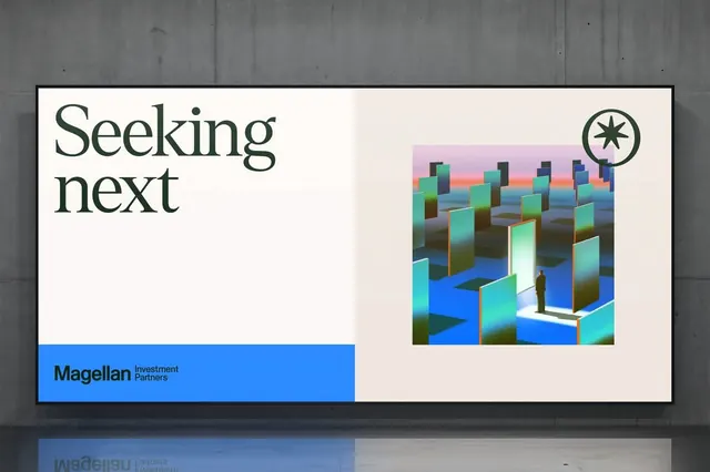
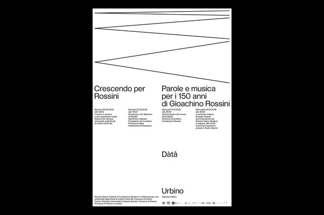
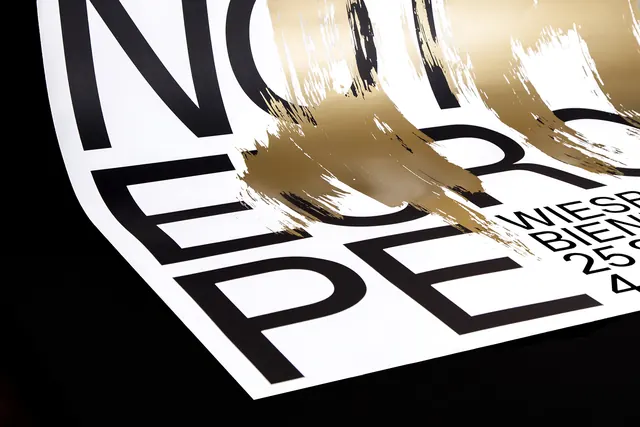
Minimal poster for a design biennale with large serif type, cream background, and earthy accent color.
Summary
A restrained biennale poster built from cream-colored paper, bold serif typography in black, and warm earth-tone accents creating a refined, gallery-quality aesthetic.
Visual description
Cream or off-white background with generous negative space. Large black serif letters form the main headline, creating strong geometric shapes through their proportions. A secondary line of smaller text sits below. A burnt sienna or taupe accent appears as either a text element or decorative bar, adding warmth. Overall composition is centered and symmetrical. The typography drives the entire design; no imagery present.
Key takeaway
The power of type alone. Combining luxe serif letterforms with disciplined whitespace and a single warm earth tone creates sophistication without ornamentation or photography. The confidence to let the type breathe is the design move.
Reuse notes
Strong default for high-end cultural or design-focused posters. Works best when the typographic forms are bold enough to sustain a full page. The cream/off-white background feels premium on print; requires careful reproduction of that paper tone in production. Pairs well with photography if a future revision adds it, but the minimal version stands alone.