Preview image. Unlock full-res
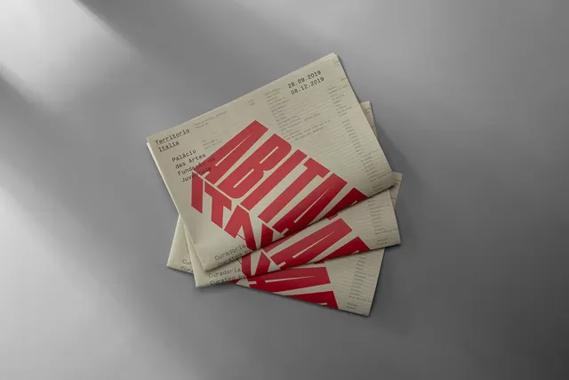
Print design composition featuring warm beige tones with deep burgundy accents creating sophisticated editorial aesthetic.
Summary
A sophisticated editorial design composition for the Abitare Italia Exhibition, balancing warm neutrals with a striking burgundy accent color.
Visual description
Landscape editorial layout (1400x934px) built on warm taupe-gray (#85817E) as the primary foundation at 89%. A deep burgundy-wine accent (#7D252A) provides dramatic contrast at 6%, suggesting typography, imagery, or design elements. Light beige-gray (#C7C7C7) comprises 3% for highlights or secondary typographic elements. The composition appears gallery-like with clear hierarchical structure typical of cultural or museum exhibition design.
Key takeaway
Earthy neutrals paired with a single bold accent color creates editorial sophistication without demanding color diversity. The warm + cool + neutral tonal structure provides visual harmony while maintaining drama through strategic contrast.
Reuse notes
Excellent reference for cultural institution branding, art direction, and editorial design. The palette works for print publications, exhibition catalogs, and luxury brand collateral. The burgundy accent is restrained enough to maintain elegance across multiple applications. Pairs well with serif typography and photography-centric layouts.
More like this


Keep what you find
A free account saves references to boards and can send you a weekly email of picks based on what you save.
To see every result, go Pro.