Preview image. Unlock full-res
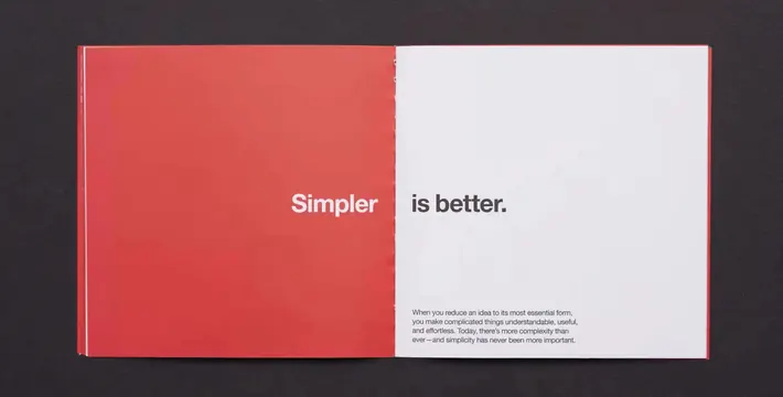
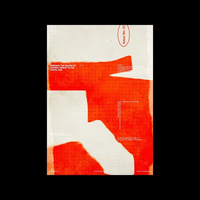
Sam Stoof's debut newsletter issue cover designs blend bold Swiss-inspired typography with distressed print textures across a series of editorial poster variants in red, orange, and off-white.
Summary
Sam Stoof's debut newsletter issue cover designs blend bold Swiss-inspired typography with distressed print textures across a series of editorial poster variants in red, orange, and off-white.
Visual description
A cream-colored cover features an organic red-orange shape that carves through the center, filled with a fine grid pattern. Bold white sans-serif text sits inside the shape explaining the publication's design philosophy. A red oval stamp with 'Issue No. 01' rotates across the top, while small text credits and details scatter around the margins.
Key takeaway
Use an abstract organic cutout shape to frame text while introducing texture through grid or pattern fills, then anchor the layout with a rotated badge or stamp for visual intrigue.
Reuse notes
Reach for this as a editorial spread reference. Pairs with typographic, editorial directions. Original by Sam Stoof.