Preview image. Unlock full-res
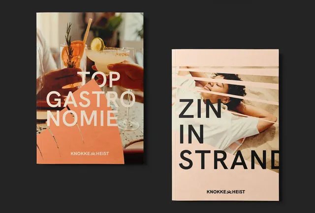
Two glossy publication covers for Knokke Heist: one food/cocktail focused (orange), one wellness/lifestyle focused (cream with portrait).
Summary
Two hardcover publication covers for Knokke Heist shown side-by-side. Left: glossy orange-coral cover with "TOP GASTRONOMIE" in bold white sans-serif, overlaid on a photograph of colorful cocktails. Right: cream-toned cover with "ZIN IN STRAND" and a cropped portrait.
Visual description
Two matching hardcover publications displayed on a charcoal background. Left book: vibrant orange-coral cover (approximately Pantone 16-1516 or similar warm orange) with bold white sans-serif type reading "TOP GASTRONOMIE" overlaid on a food/beverage photograph. The photo shows hands holding craft cocktails, fresh citrus, and garnishes in warm, natural lighting. Small white branding "KNOKKE HEIST" at bottom. Right book: soft cream or pale sand-colored cover with large dark navy or black sans-serif type reading "ZIN IN STRAND". The cover features a cropped photograph of a reclining person in a white shirt, partially obscured by horizontal white lines creating an abstraction effect. Small branding "KNOKKE HEIST" at bottom right. Both books are premium quality with glossy finish and consistent design language. Spines visible showing spine text. The color palette (warm orange + cool cream) creates visual complementarity.
Key takeaway
A coordinated publication series using different dominant colors and photographic treatments while maintaining consistent typography, branding, and structure. Each cover is distinct in personality (food vs. lifestyle) while belonging to the same family. The technique of overlaying geometric lines on portraiture creates interest without overwhelming the image.
Reuse notes
Strong template for multi-volume publication series. Using color variation on each volume (rather than identical design) helps readers differentiate while recognizing the collection. The photographic backgrounds ground the publications in authentic experience. Works well for lifestyle, travel, food, and hospitality brands. The cream/sand palettes are warm and inviting; the warm orange is energetic but not garish. Best used for premium, curated publications rather than mass distribution. Pairs well with quality paper stock and glossy finish.
More like this




Keep what you find
A free account saves references to boards and can send you a weekly email of picks based on what you save.
To see every result, go Pro.