Preview image. Unlock full-res
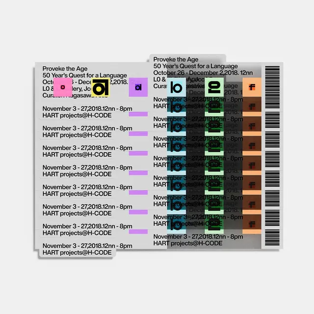
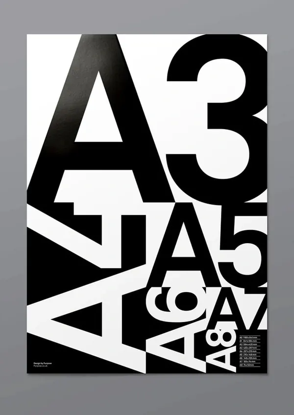
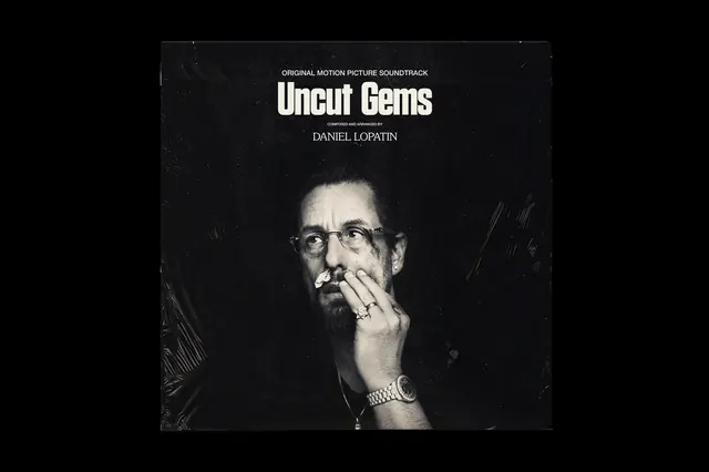
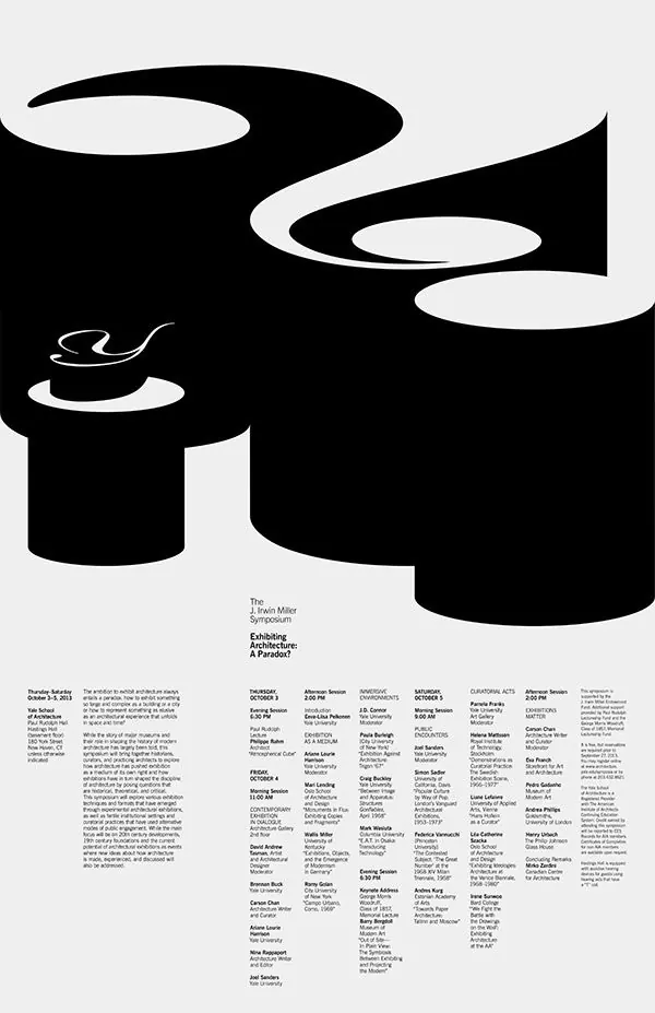
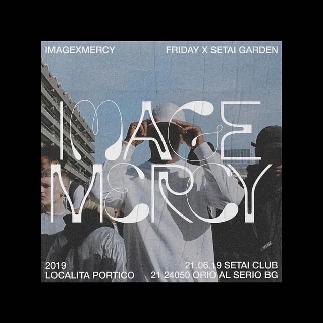
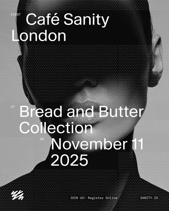
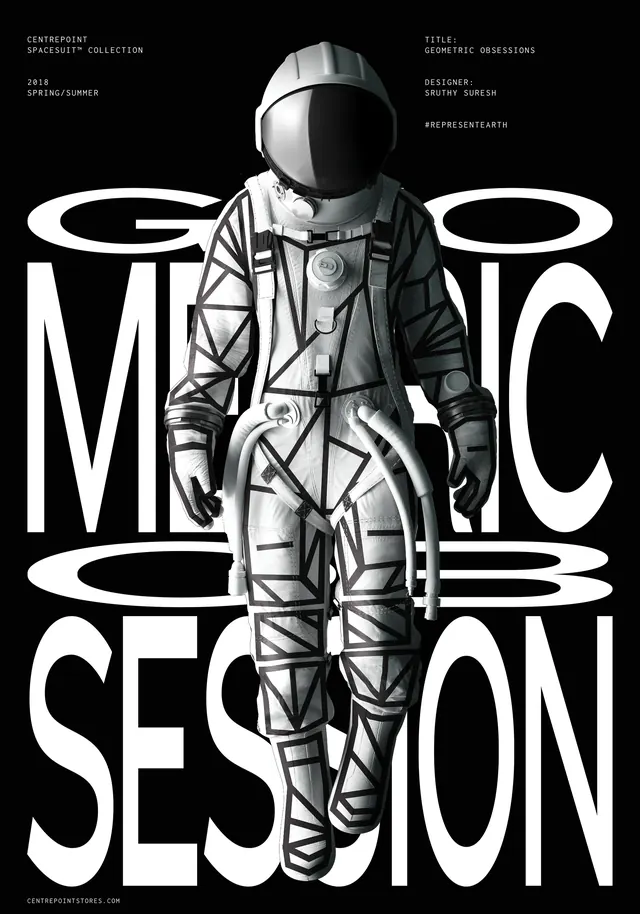
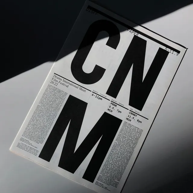
Editorial poster for drama festival with massive black letterforms overlaid on event information and text blocks.

Summary
A drama festival poster built from oversized black sans-serif letterforms arranged asymmetrically over dense text blocks and smaller typography detailing event dates and venues.
Visual description
Angled photograph of a printed poster on white or light background. Massive black letters dominate the composition, with body copy and event information (dates, venues, times) stacked in smaller sans-serif type. The design mixes scale aggressively—headline letterforms are 4-5 times larger than body text. Text wraps and sits at different angles. Black ink on white/light stock. The poster appears to be printed on a slightly glossy paper with visible shadows cast by the angled photography.
Key takeaway
Extreme typographic hierarchy—making the largest elements the most important visually. The contrast between massive headlines and dense information creates visual rhythm and guides the eye. Black and white forces perfect typography execution; no color rescue possible.
Reuse notes
Reference for editorial design, festival posters, and experimental typography. Best when you need to convey complex information (dates, times, venues) while maintaining visual drama. The monochrome makes it reproducible at low cost. Works best in print, though it translates to digital too.