Preview image. Unlock full-res
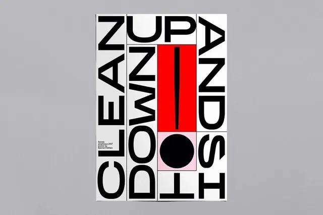
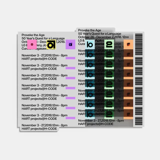
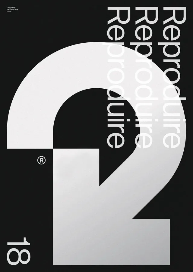
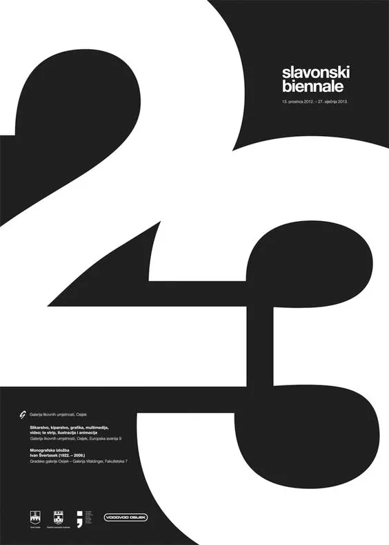
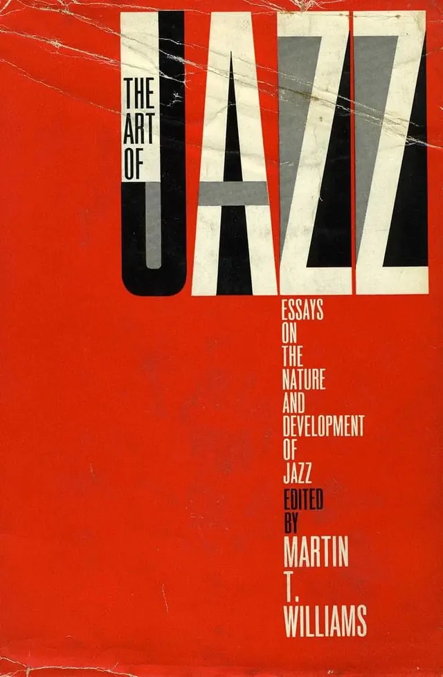
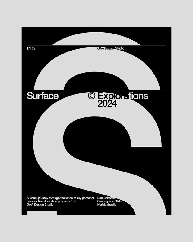
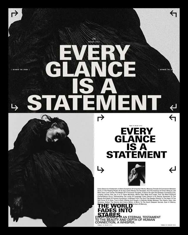
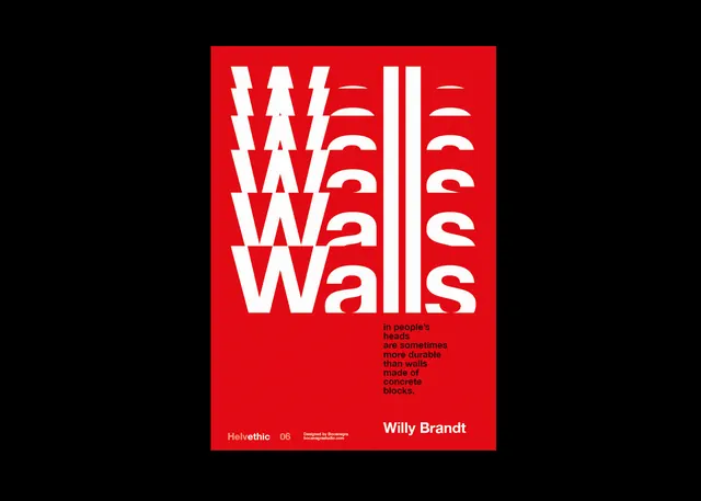
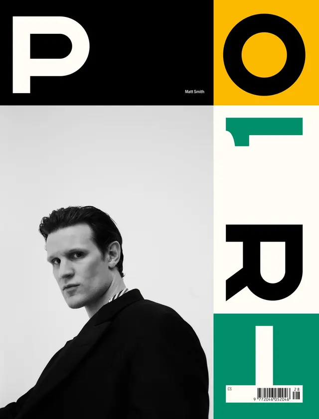
Magazine cover with split geometric layout: bold typography on dark and bright sections, paired with a portrait photograph and decorative typography elements.
Summary
A striking editorial magazine cover split into geometric color blocks featuring large display typography, a male portrait in grayscale, and decorative type elements in bright accent colors against dark and light grounds.
Visual description
The cover is divided into four quadrants or sections. Top left: black background with a massive white sans-serif letter "P" and the name "Matt Smith" in smaller type. Top right: gold/yellow background with a large black letter "O". Bottom left: light gray background with a portrait photograph of a man in profile, looking toward the right, wearing dark clothing; the portrait is black and white. Bottom right: white background with a large teal/green letter "U" and a barcode in the lower corner. Overall: sans-serif typography dominates, with high contrast between backgrounds and letters. The layout is orderly and modular. A magazine issue number is visible at the bottom (appears to be issue 8).
Key takeaway
Geometric grid-based layouts with typography as primary visual. The use of single letters as design elements (P, O, U) creates abstraction while maintaining legibility. The monochrome portrait grounds the cover in humanity against bold graphic forms. High-contrast color blocking is eye-catching at newsstands.
Reuse notes
Perfect for editorial, art, and luxury publications. The modular layout is adaptable for different names, topics, or issues. Works well as a poster or art installation piece. The geometric/Swiss sensibility is timeless. The letter-abstraction could obscure meaning if not careful with letter choice. Best for audiences appreciating editorial design.